
12 Paint & Sip Pottery Ideas to Try

Listen, is pottery painting your new obsession because girl, same.
So much so, I’ve made it our very first event in our brand new Sip Series. On Thursday 19 March we’ll scooting on down to Social Pottery in Balham to sip on some fizz and paint up a storm (hopefully).
Tomorrow will not be my first rodeo but if you’re new to the pottery painting game I am here to lead you away from the rookie errors I have made in the past. For my first (and second) time, I made the mistake of going in completely blind. Sat there, watching the clock tick tick tock, convinced I had more time than I did… only to leave with crockery ‘a la Taragh’ that has never seen the light of day. Not even accidentally.
A humbling experience.
So, in an effort to stop you from making the same mistake (you’re welcome), I’ve gone slightly overboard and pulled together some of my favourite designs to inspire you ahead of our first Sip Series: Paint & Sip this Thursday.
Because when you sit down and suddenly have to decide what masterpiece on a plate you want to create... it’s a lot.
If you’re joining us, think of this as your pre-event prep. If you’re not, honestly, still enjoy — and maybe consider this your sign to come to the next one.
And yes, I am a Virgo, so everything is neatly organised by theme. Of course it is.
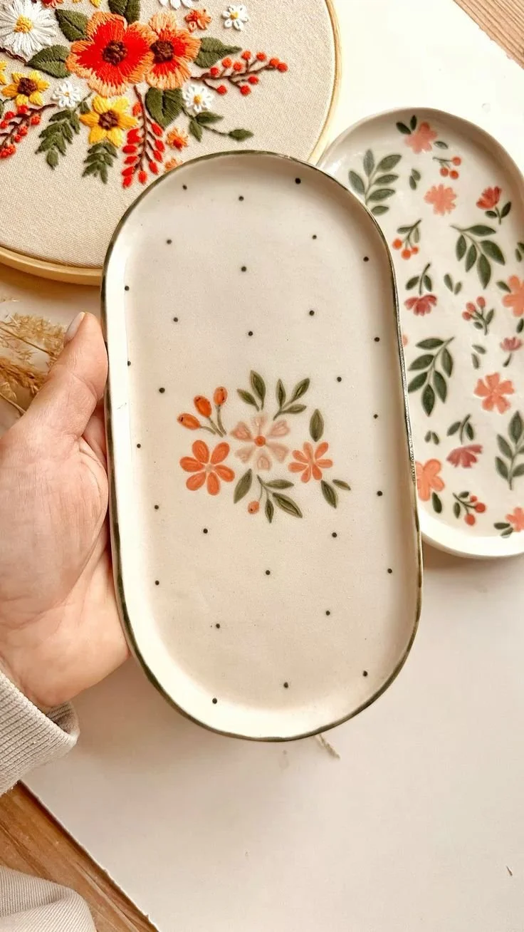
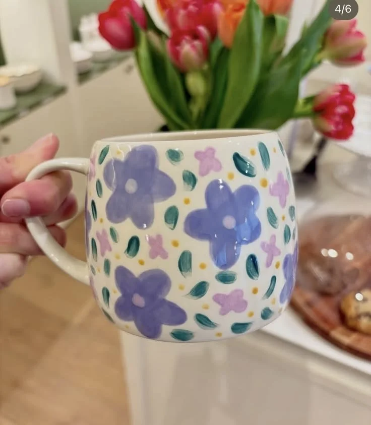
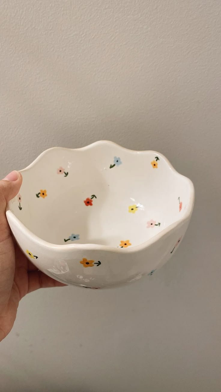
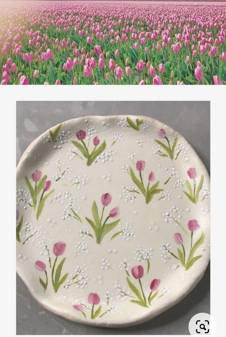
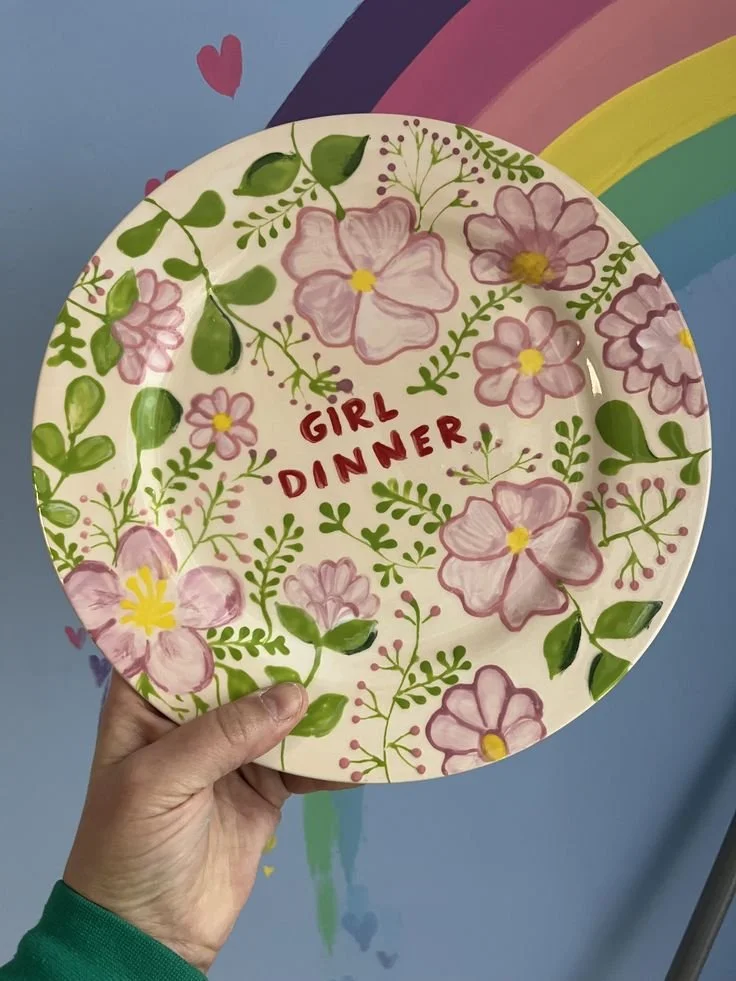
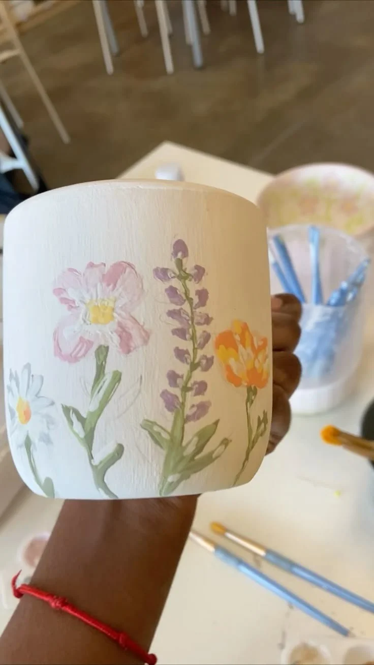
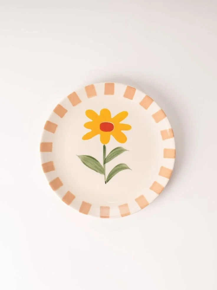
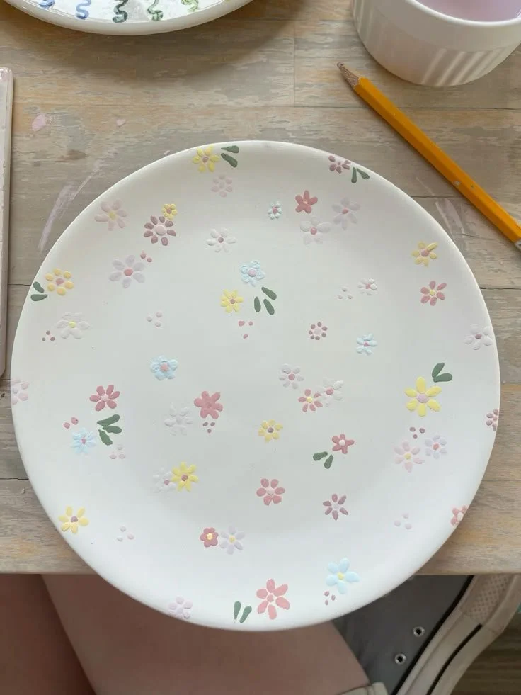
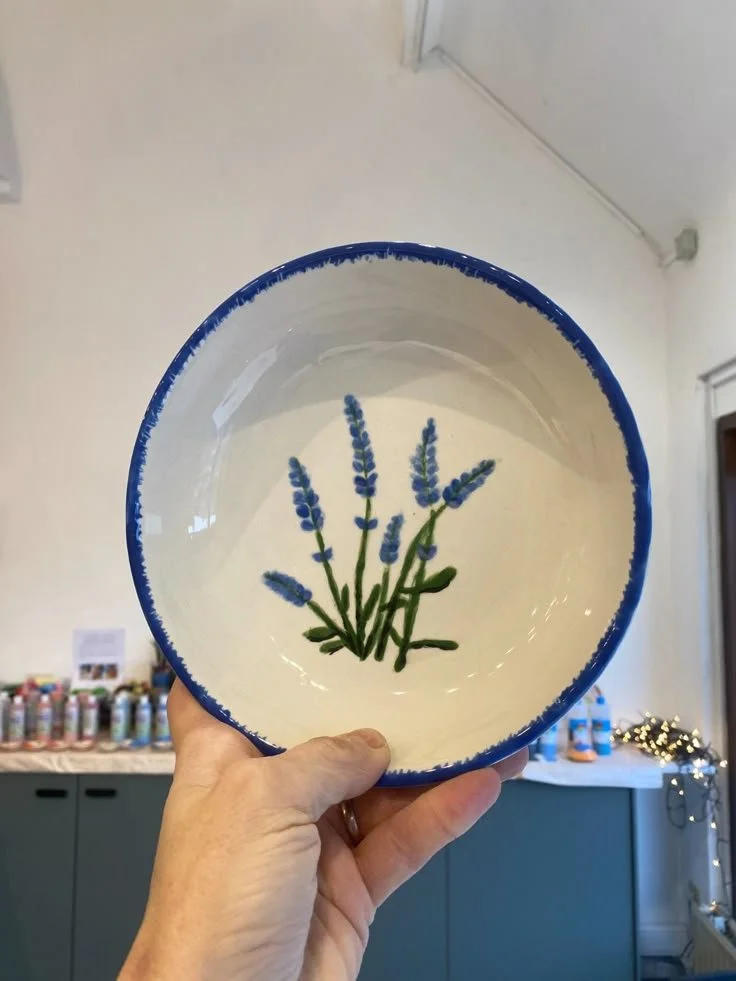
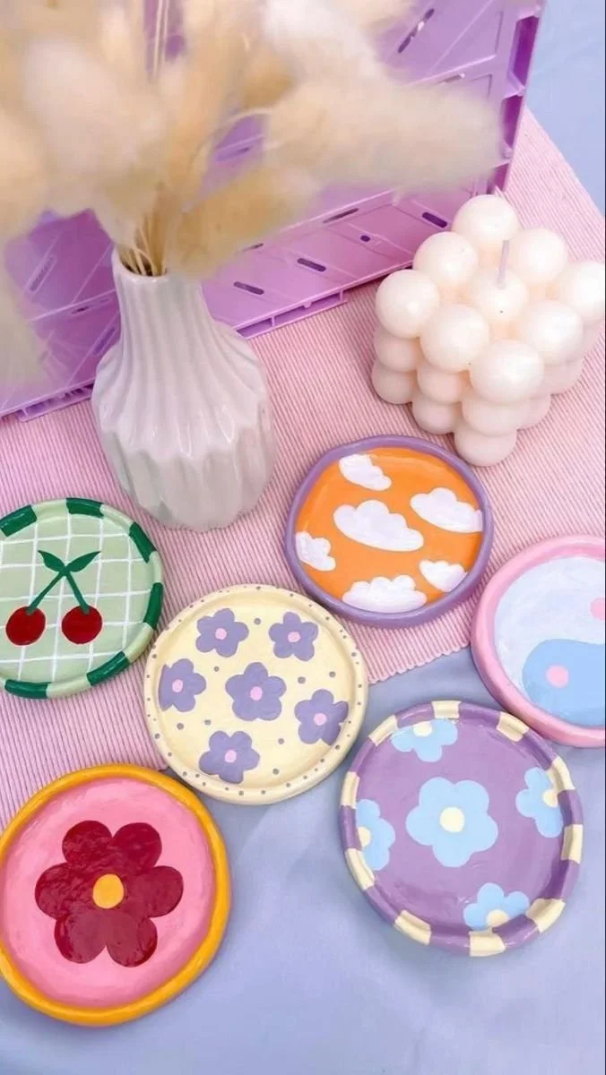
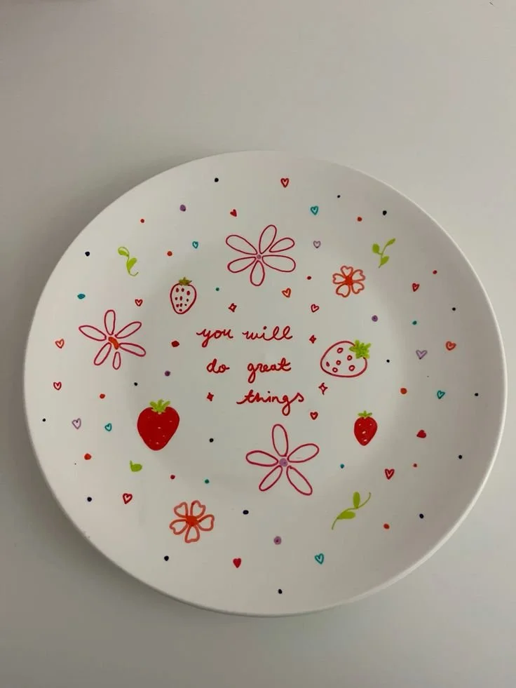
Flowers
“Florals, for Spring? Ground-breaking.”
Look, we had to start with florals. Not only is the sun shining for once, florals always deliver. Whether you go soft and delicate or bold and slightly chaotic, there’s something very satisfying about painting something that looks like it belongs in a kitchen you definitely can’t afford in real life.
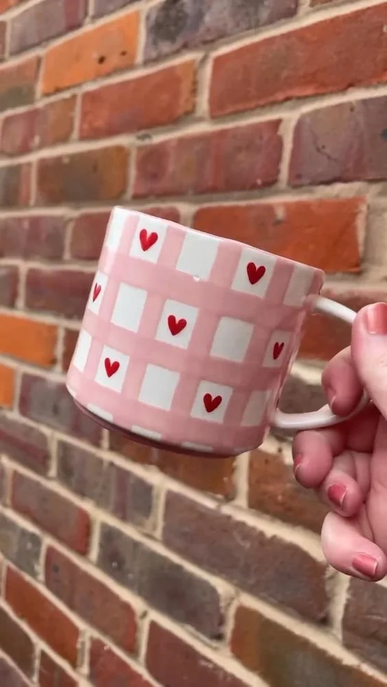
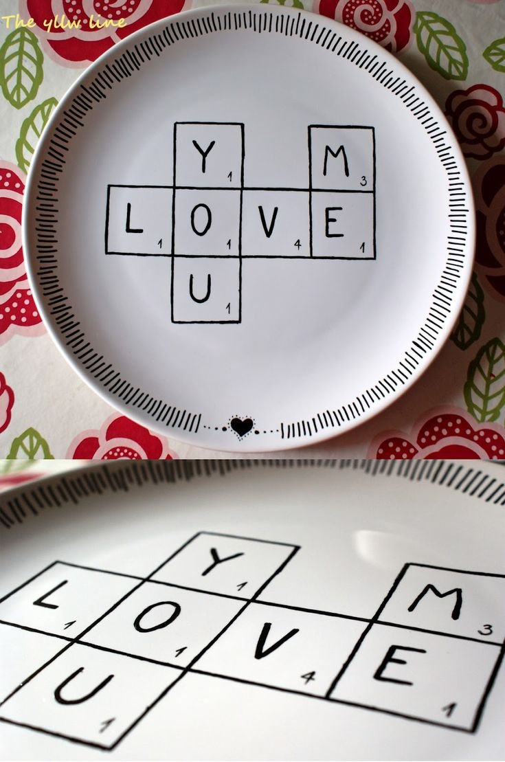
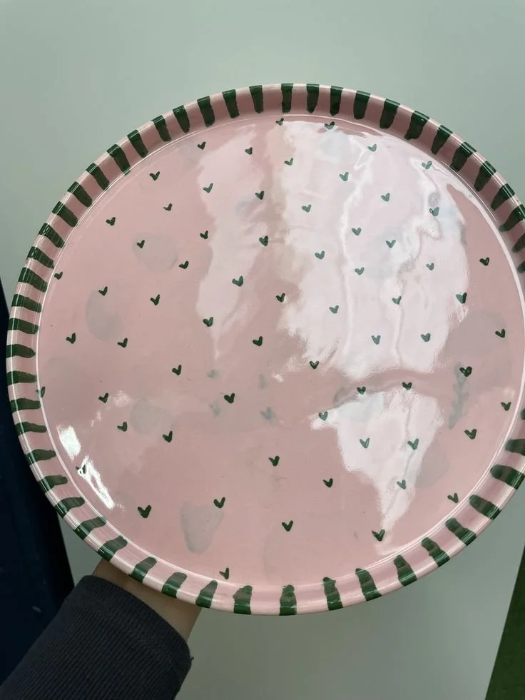
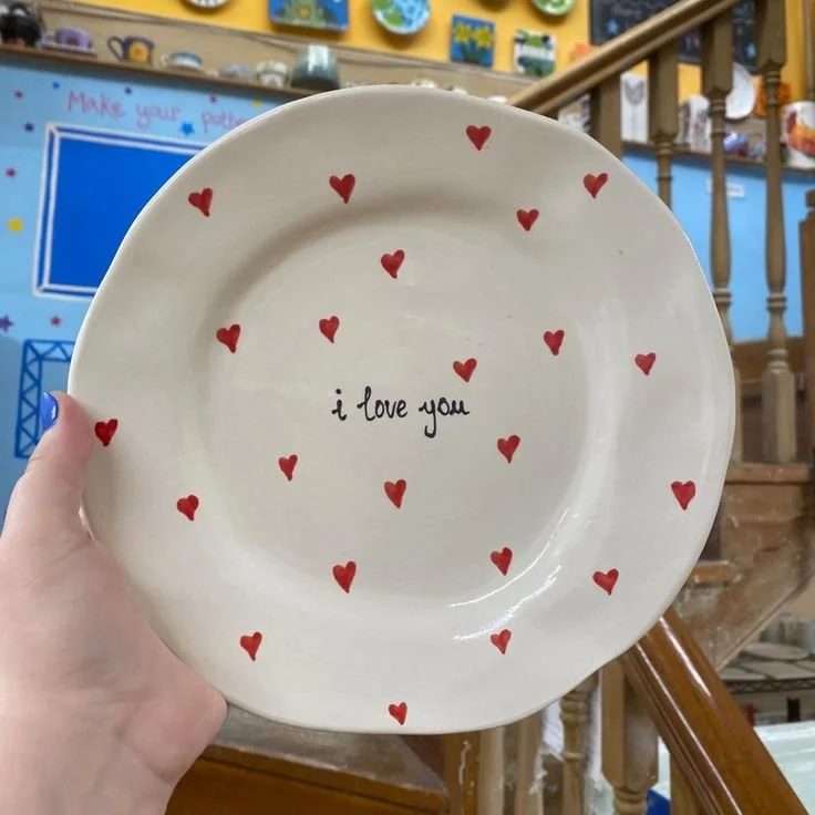
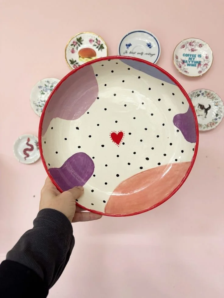
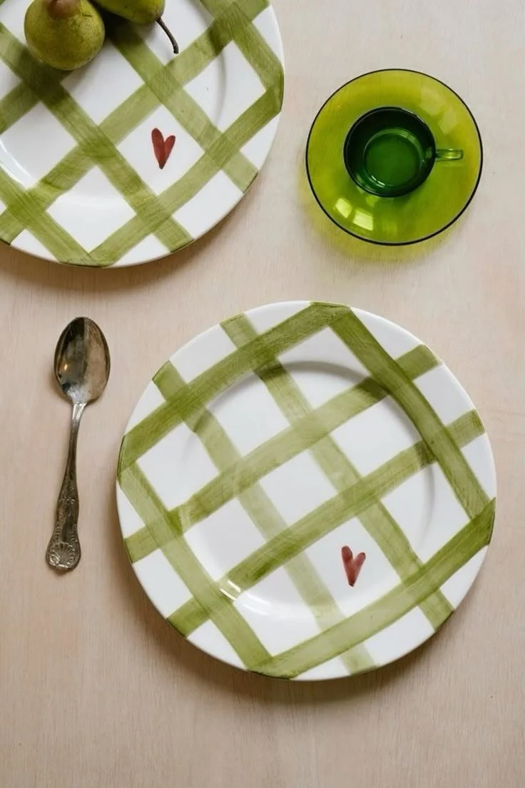
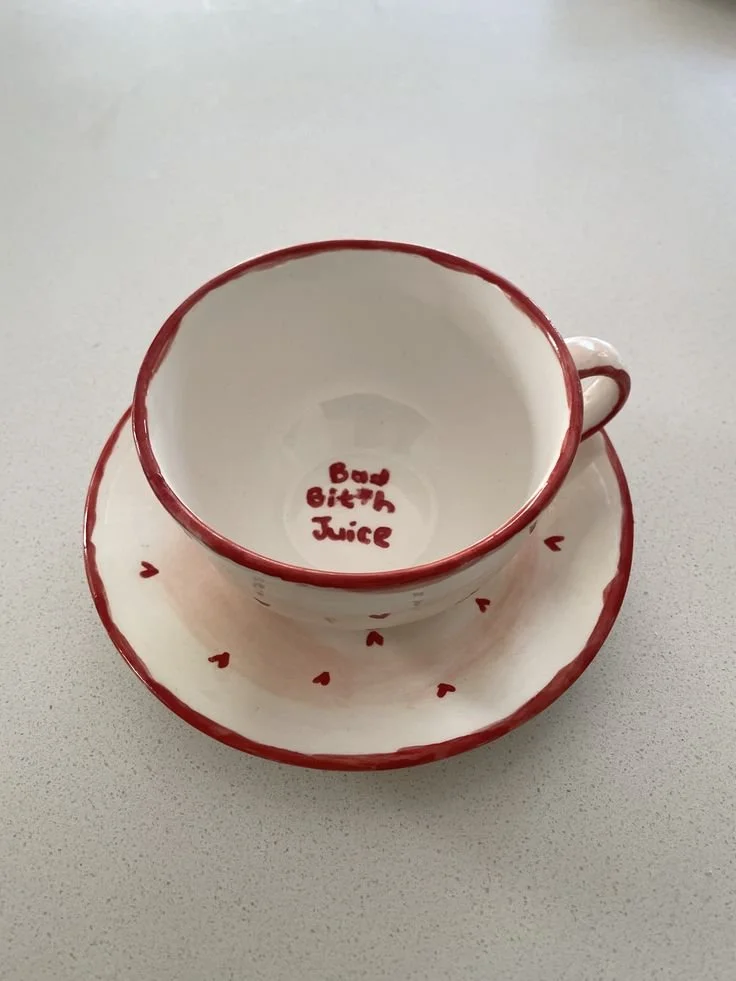
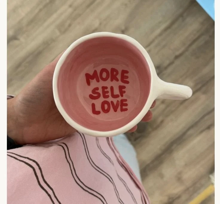
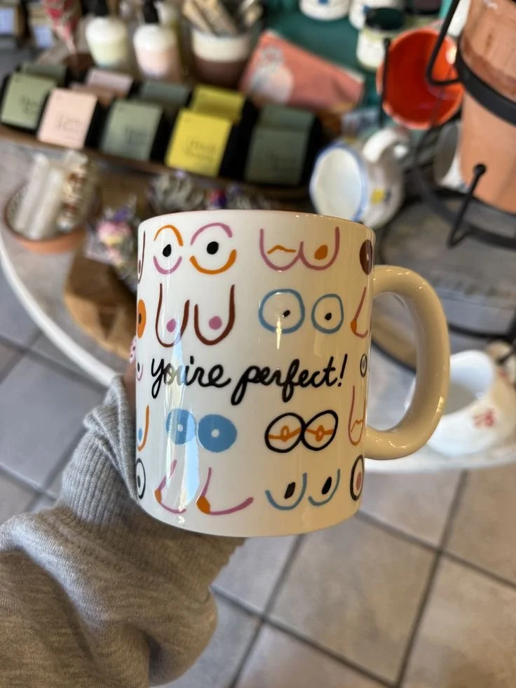
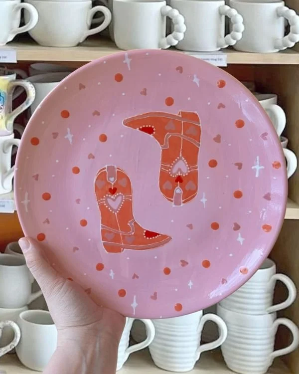
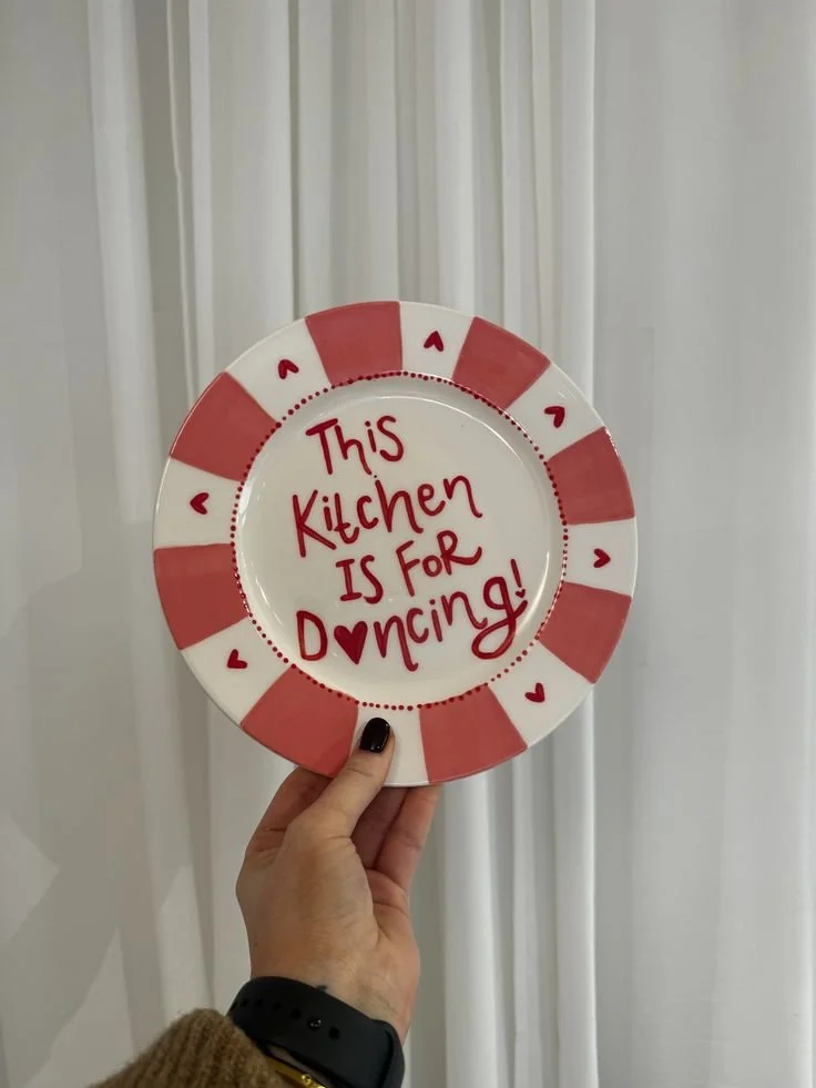
Love Love Love
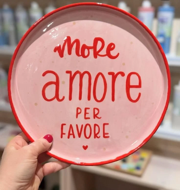


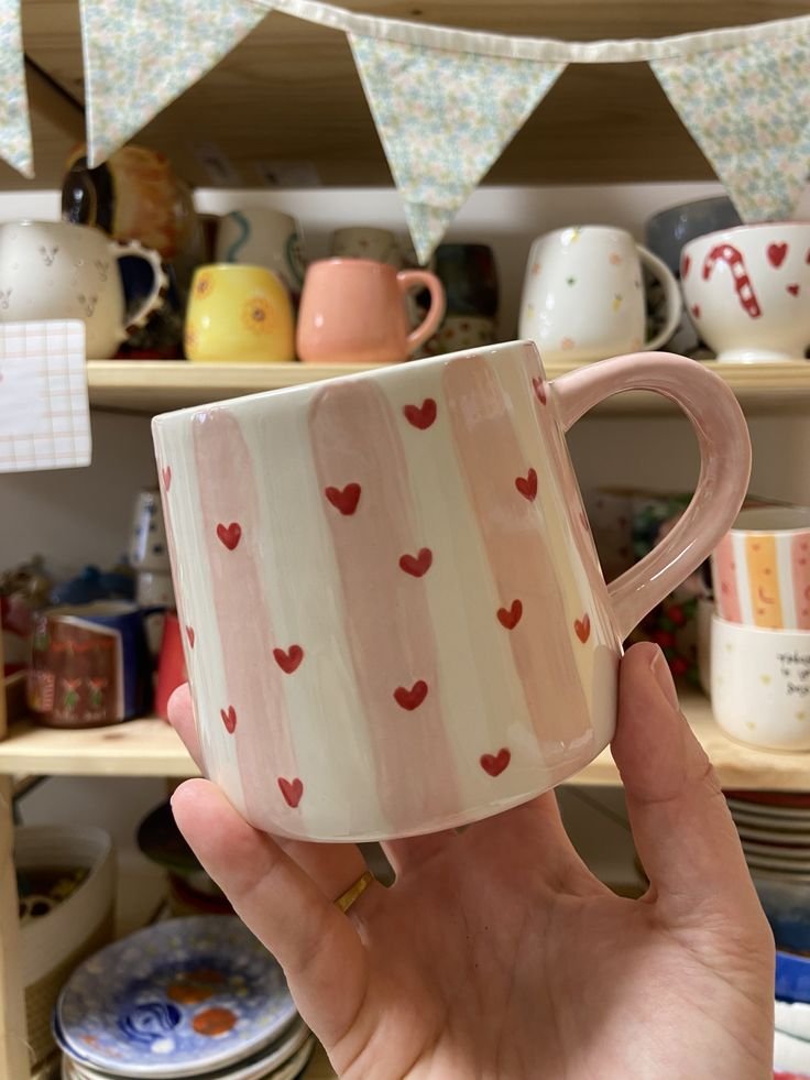

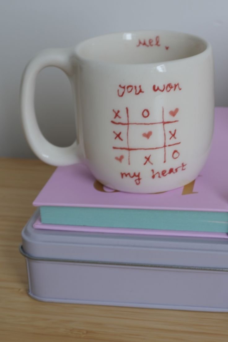
Love is a many splendored thing
Love lifts us up where we belong
All you need is love!
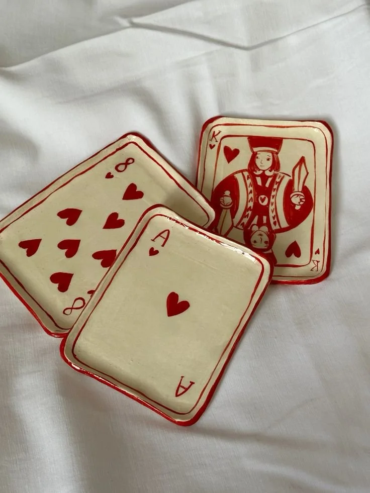
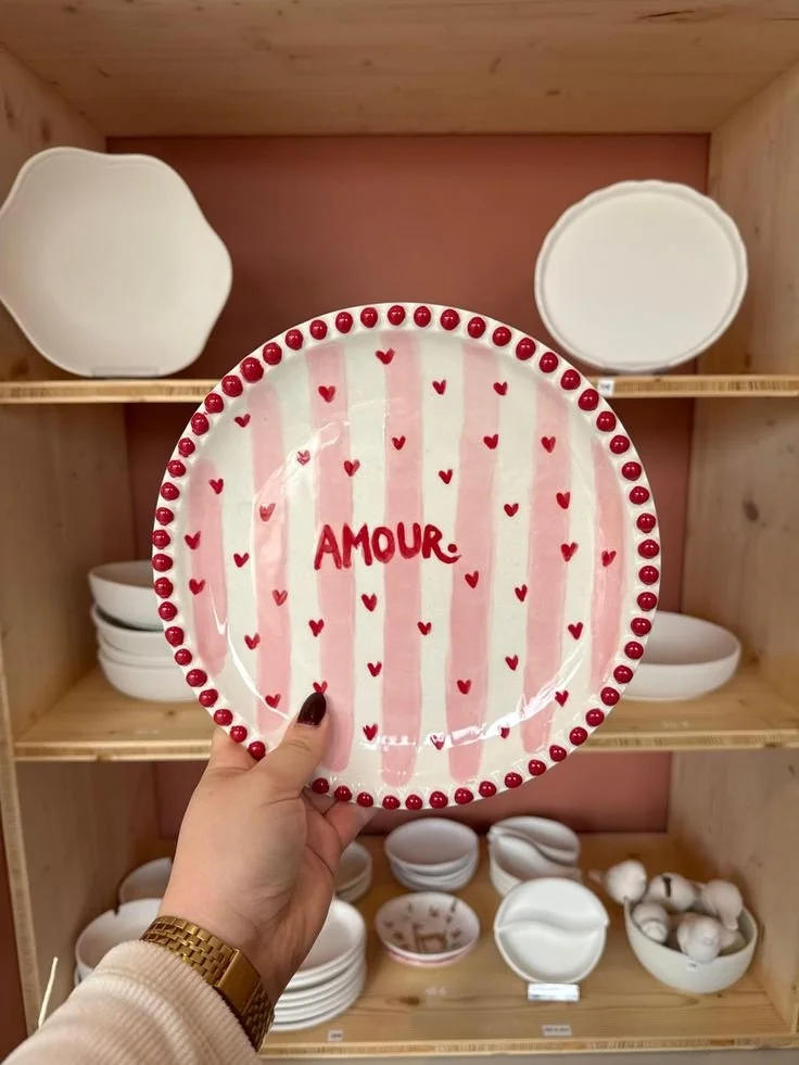
Hearts, pink, red, more hearts. Sweet nothings to yourself? To a hot crush? To your bestie? All you need is love!
Whether it’s romantic, platonic, or just aggressively self-loving, there’s no such thing as too much here. And honestly, painting something covered in hearts feels like a very valid form of self-care.
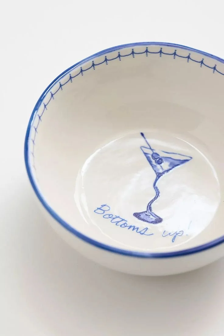
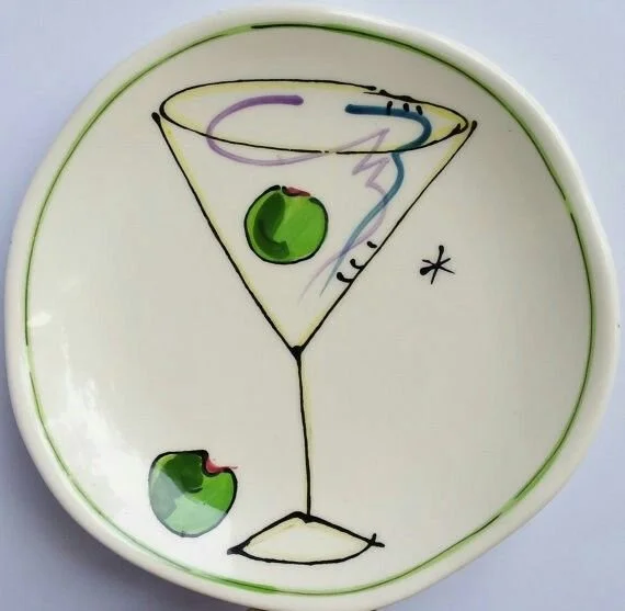
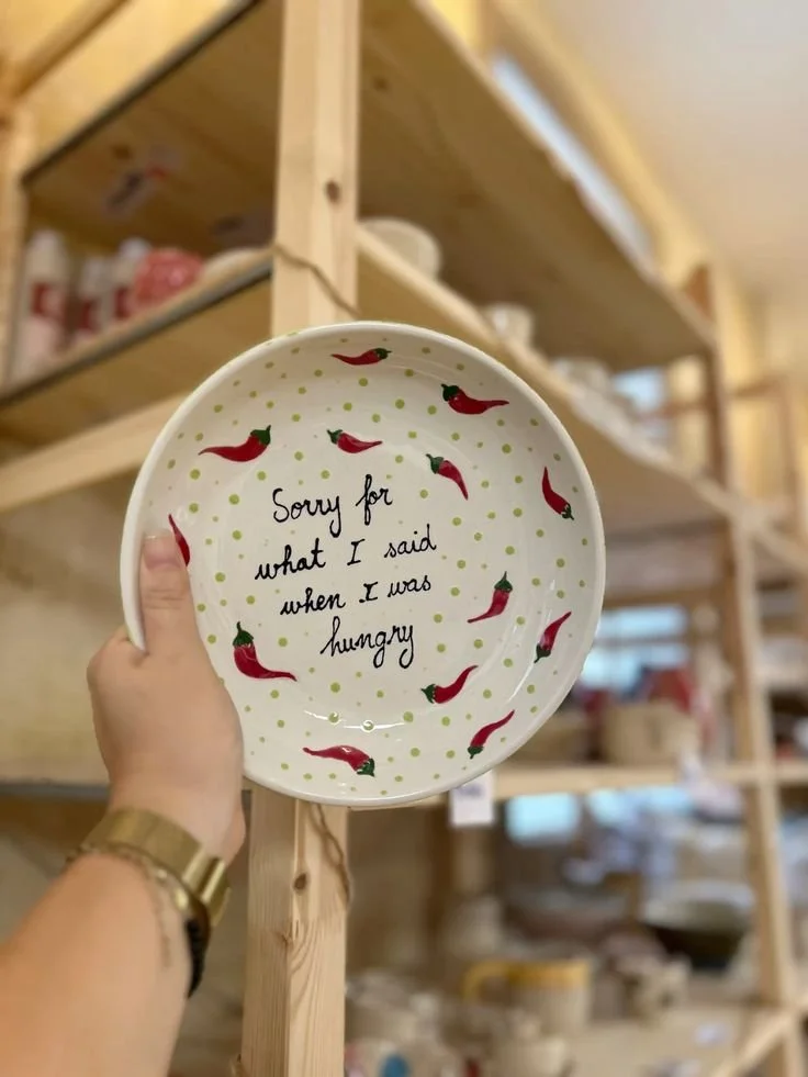
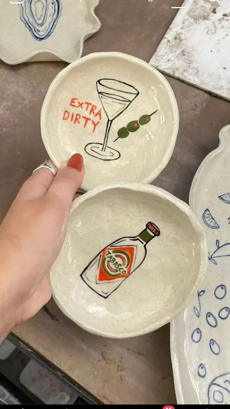
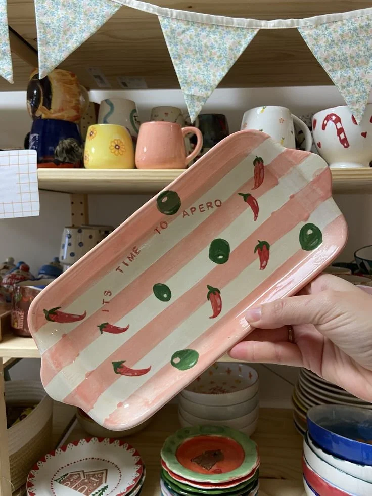
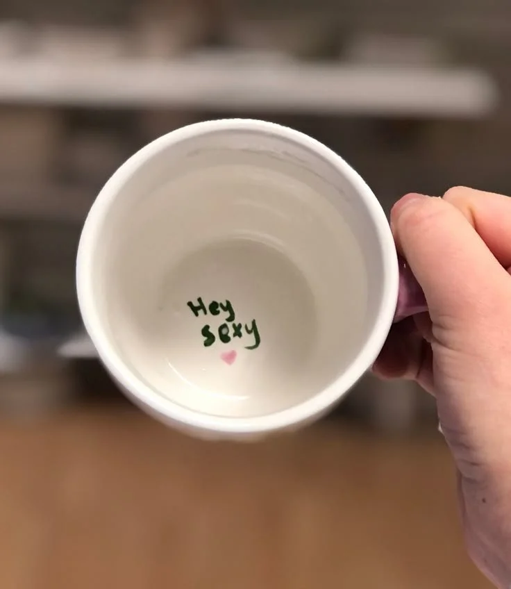
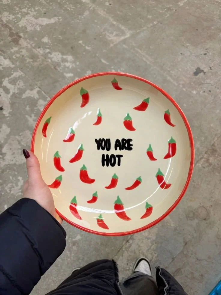
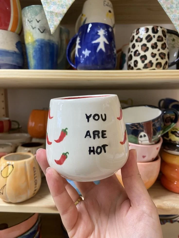
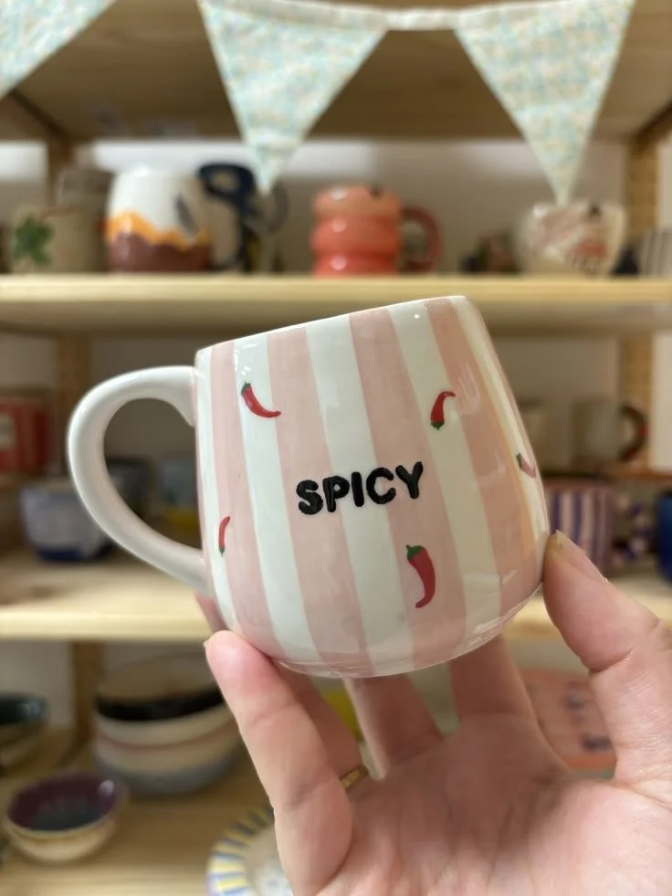
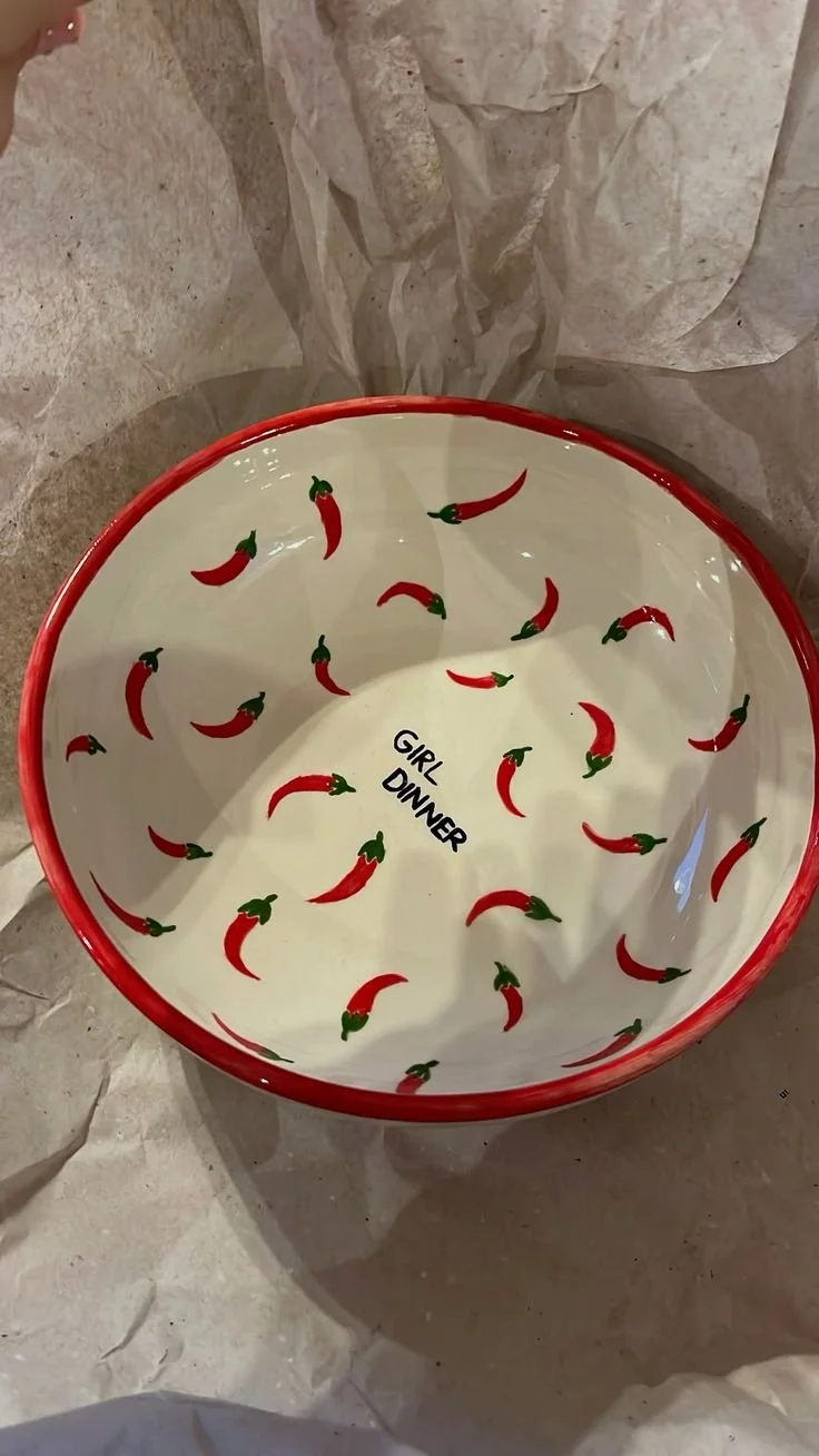
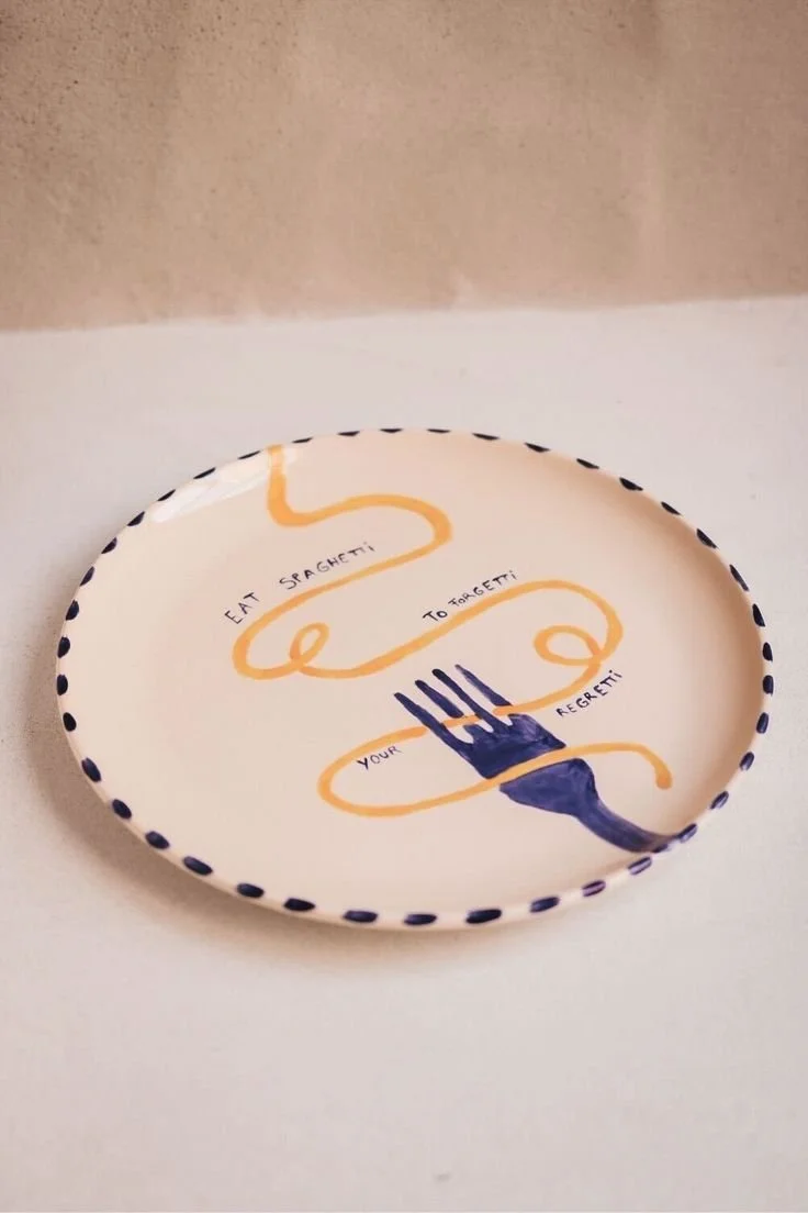
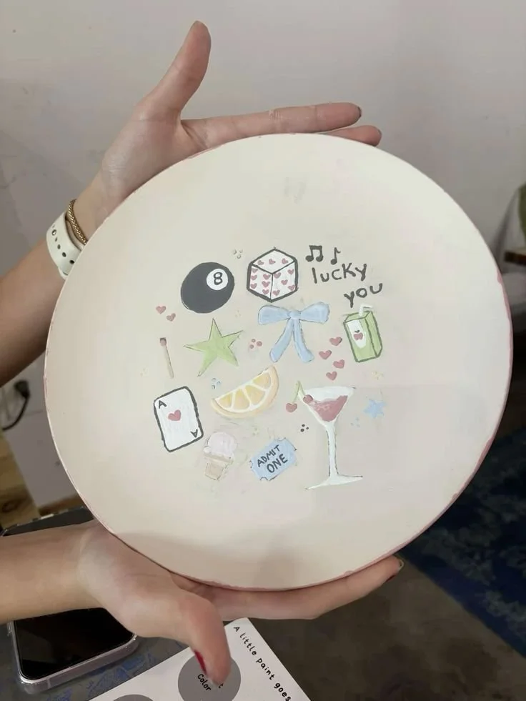
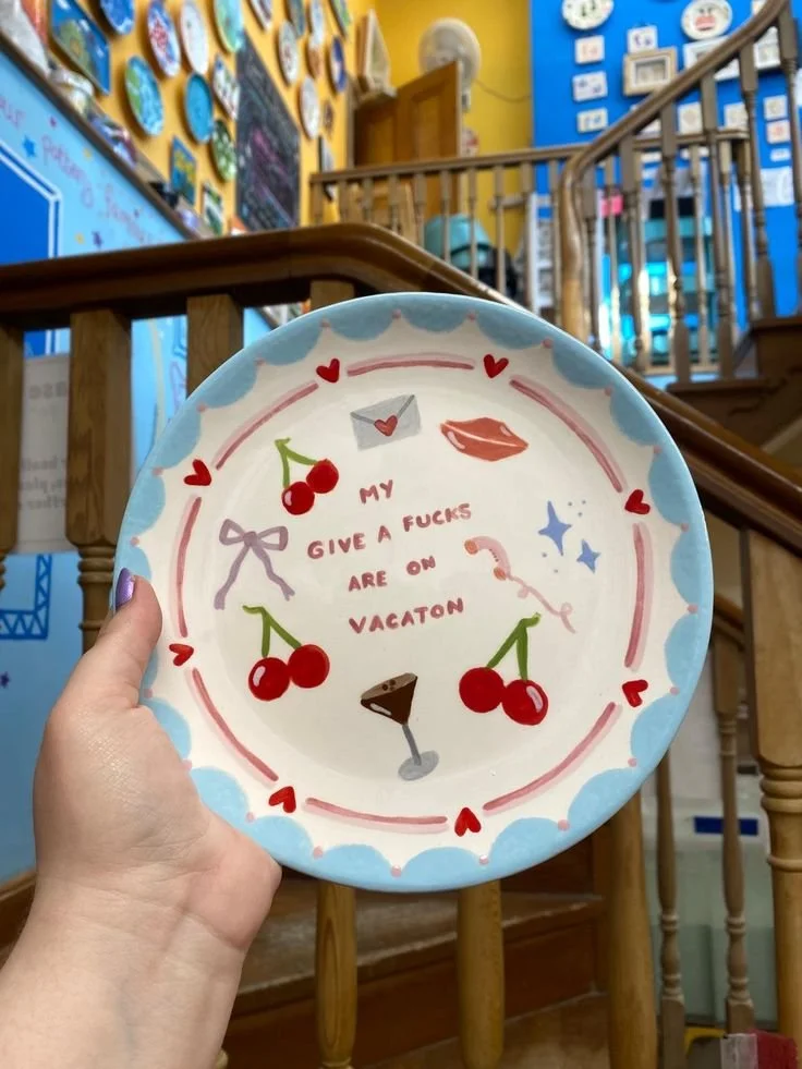
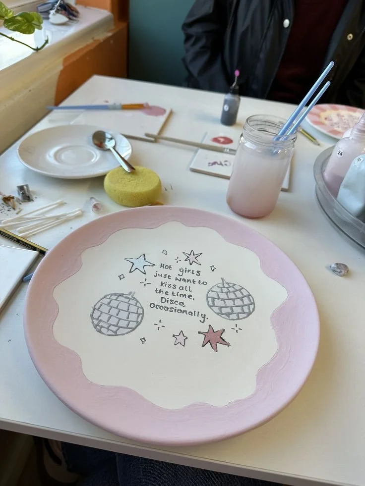
Now add a little spice…
A chilli here, a cheeky phrase there… suddenly your plate has a personality.
This is for those of you who want your pottery to feel a little flirty, a little mischievous, like it knows something the rest of us don’t. Think Fleabag energy. A wink, but make it ceramic.
Hot girls paint pottery. I don’t make the rules.
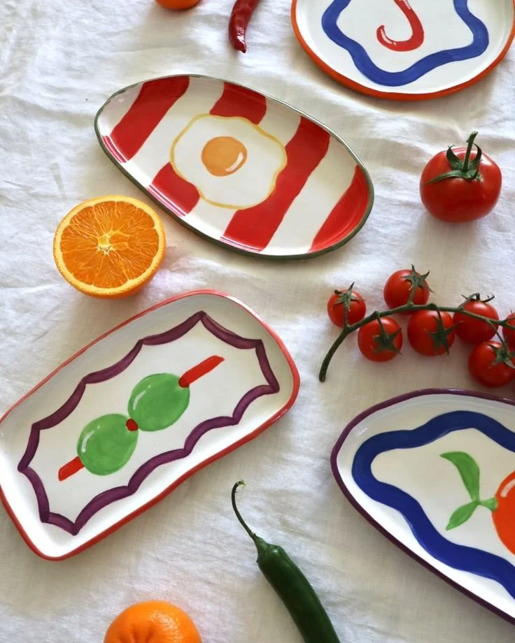
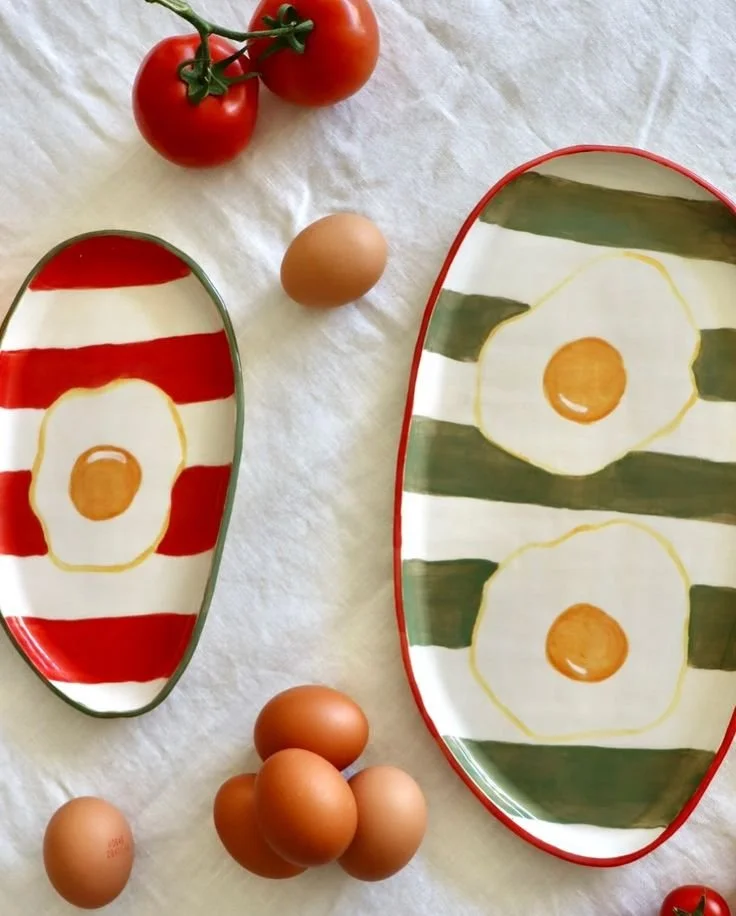
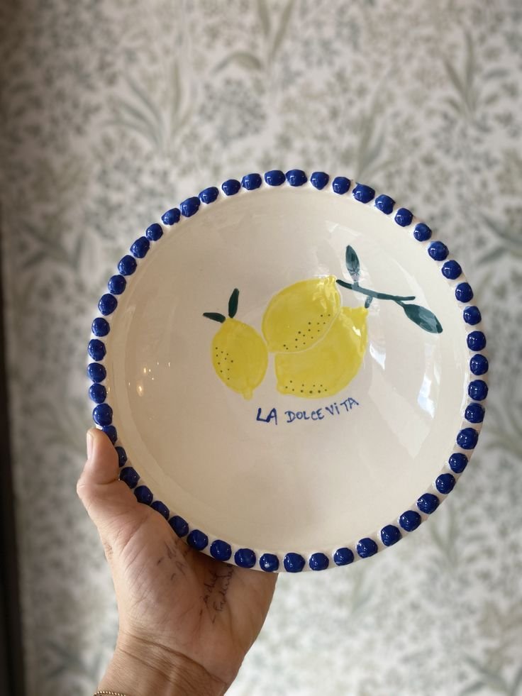
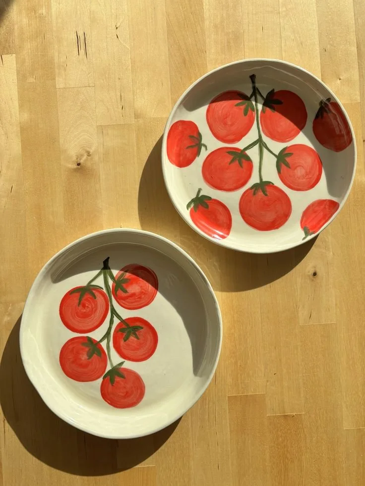
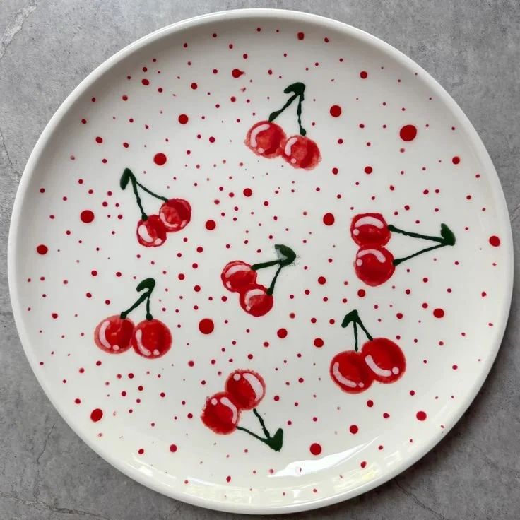
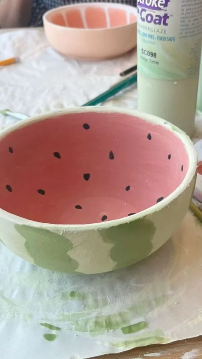
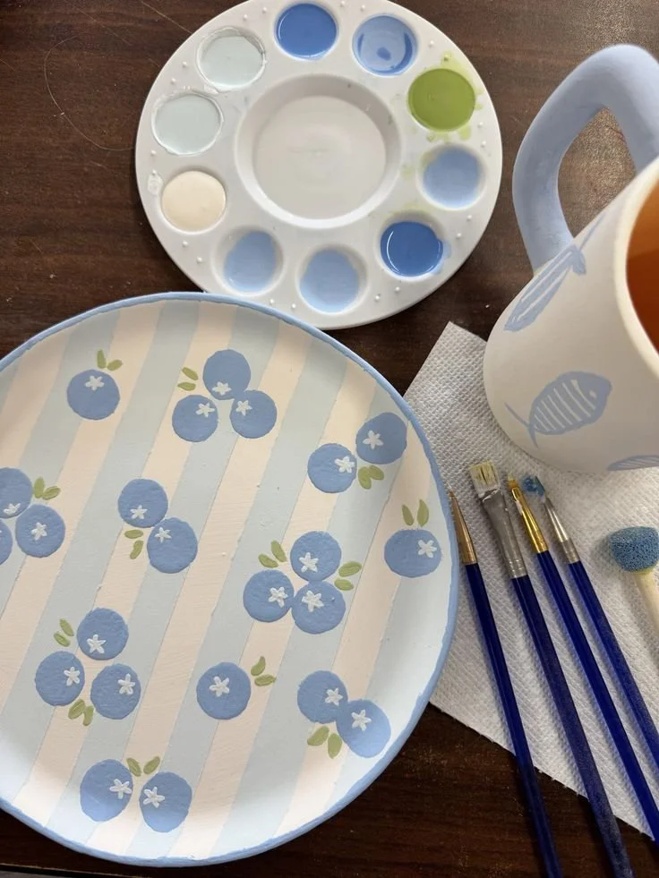
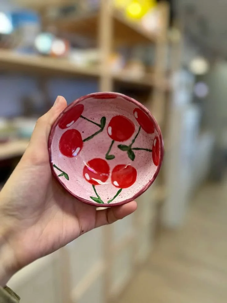
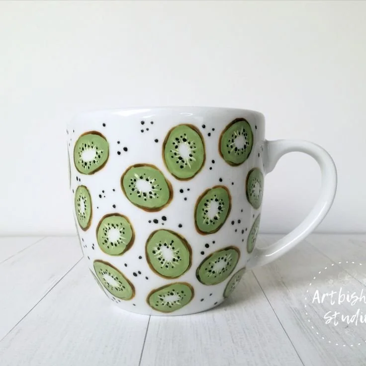
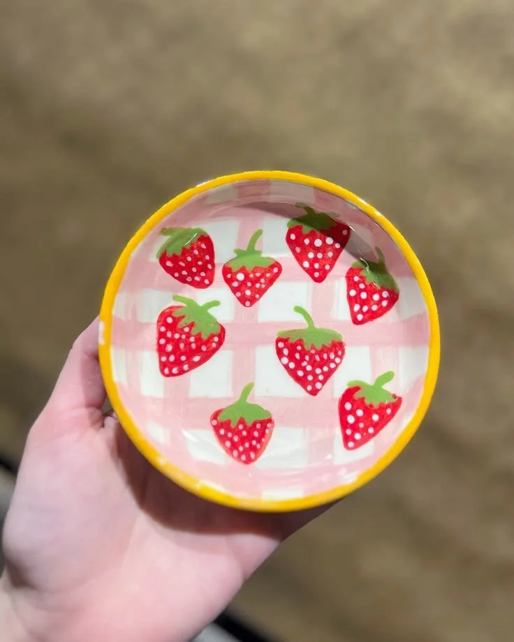
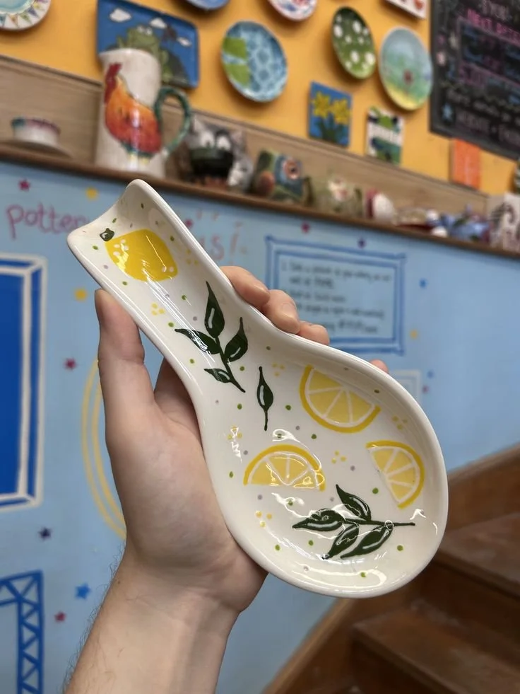
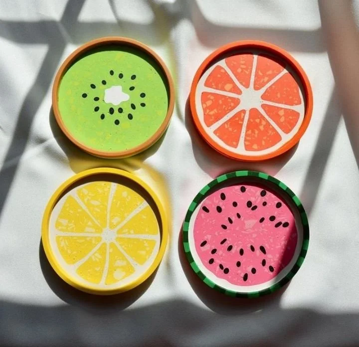
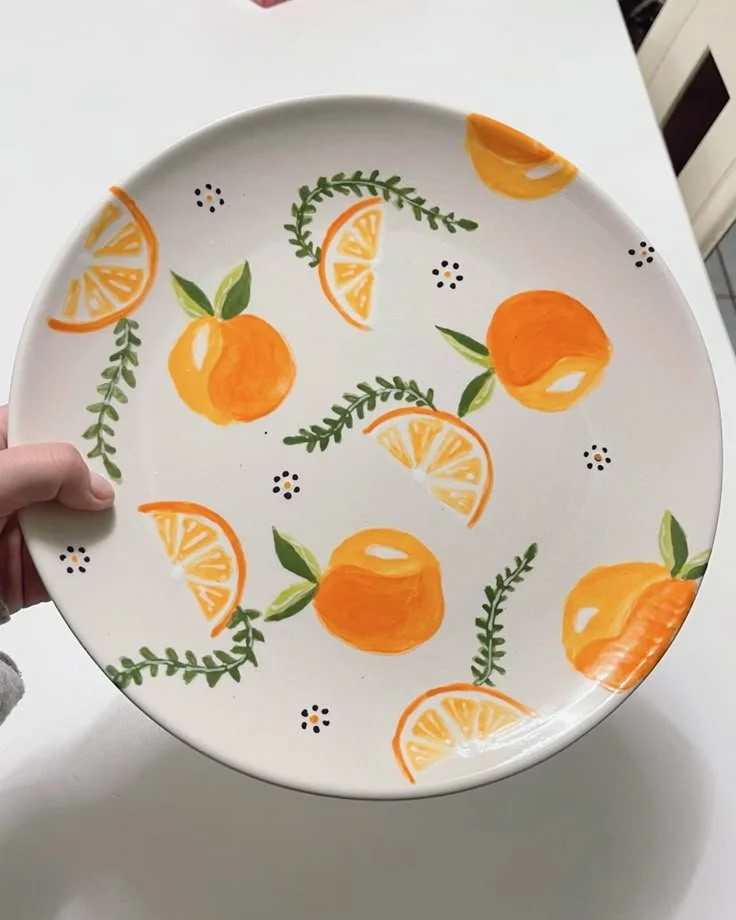
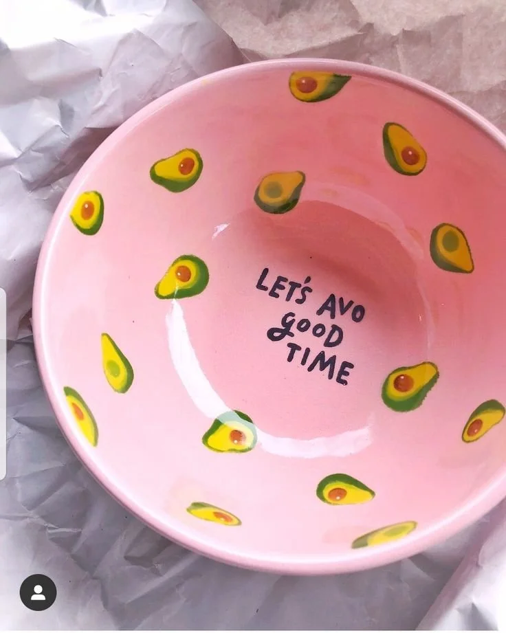
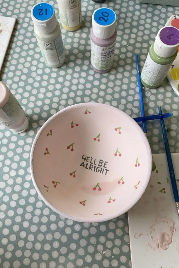
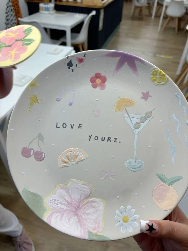
Fruit and Veg
Feeling Fruity? Need your five-a-day? Pop it on a plate!
Fruit and veg designs are having a moment and honestly, we get it. Tomatoes? Chic. Lemons? Timeless. A slightly wonky strawberry? It’s Wimbledon soon!
There’s something very joyful about turning everyday things into something you’re weirdly proud of.

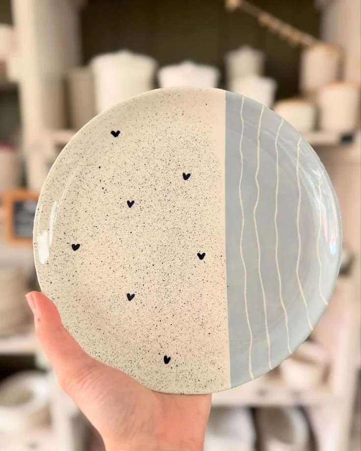
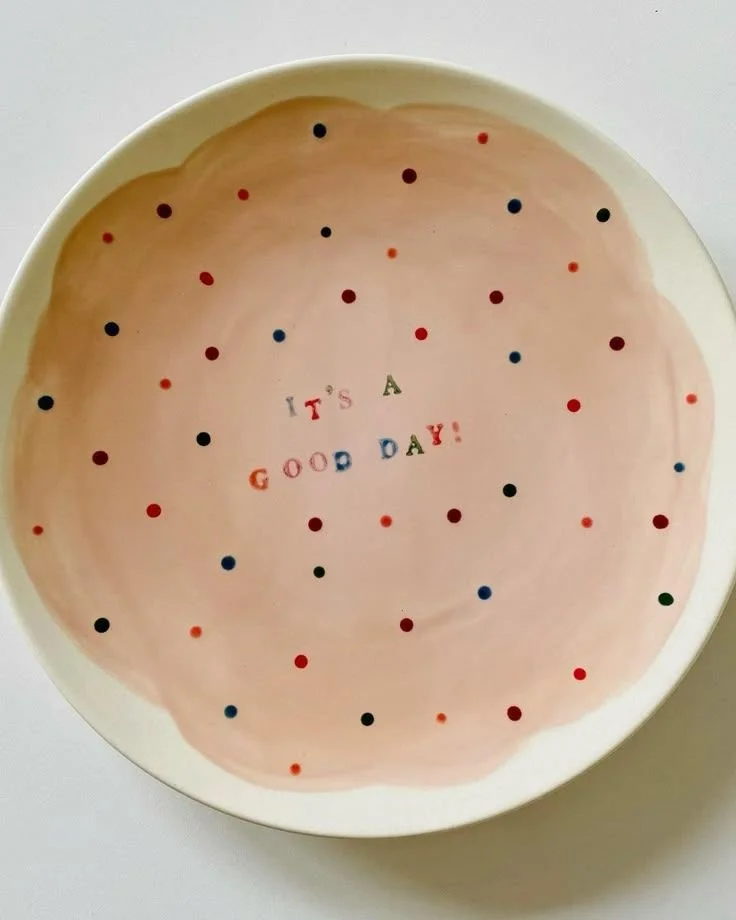
Spots and Stripes
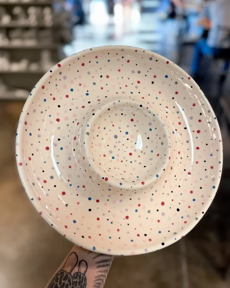
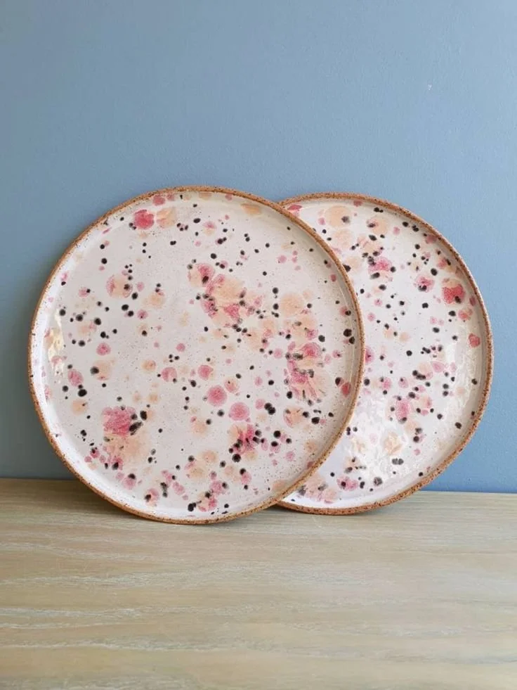
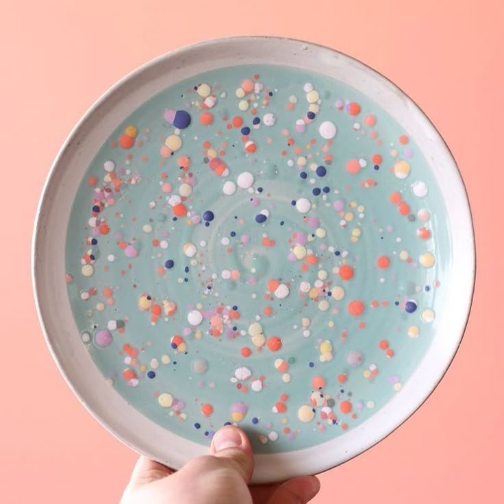
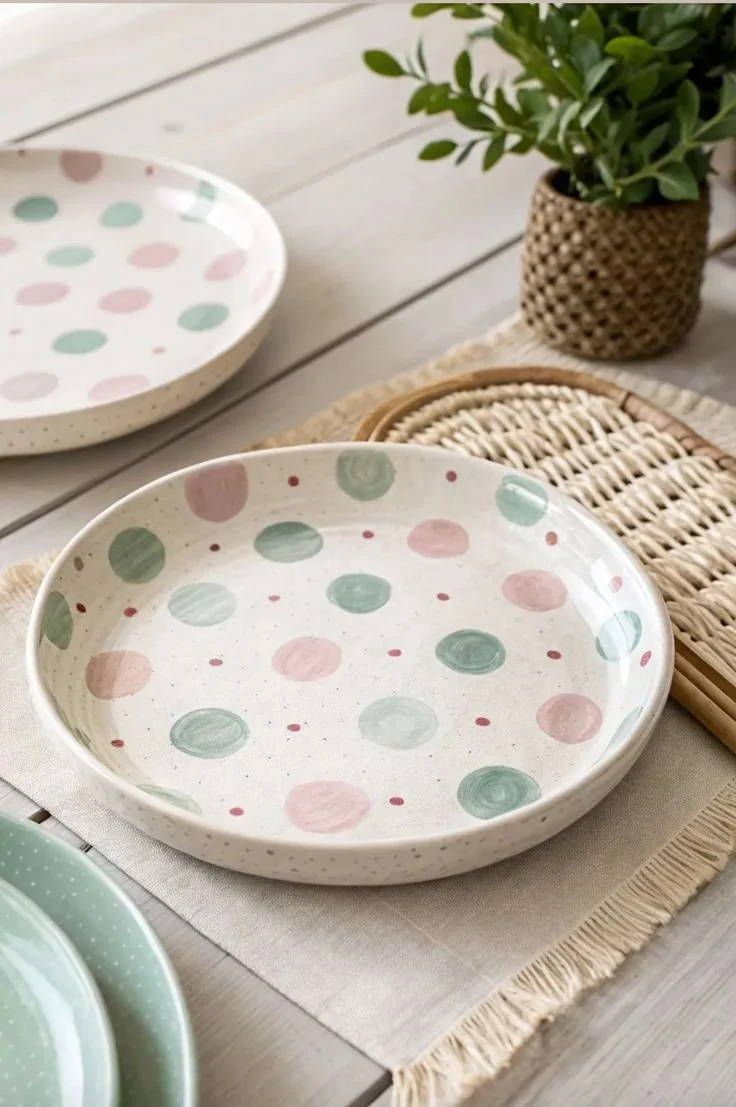
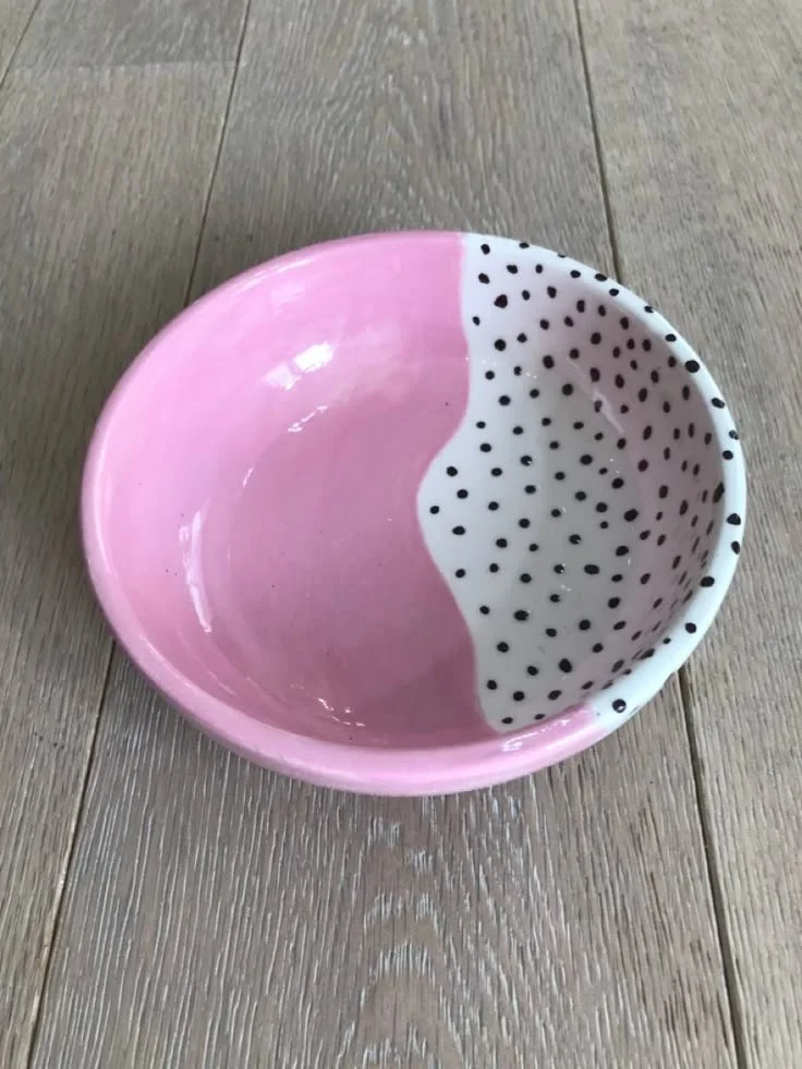
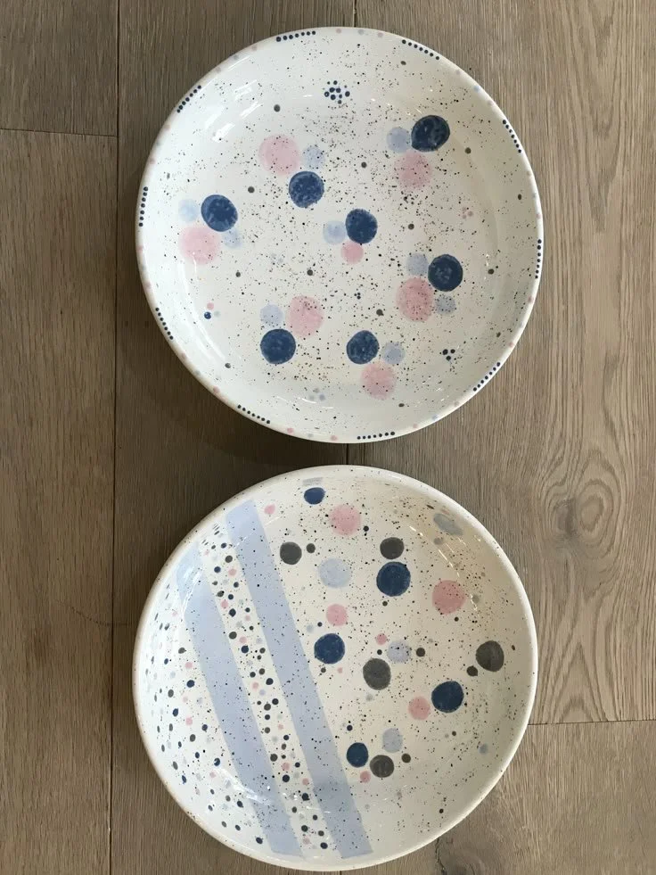
Spots
Polka dots are one of those things that just refuse to go out of style. They’re playful without trying too hard, nostalgic in a way that still feels fresh, and somehow manage to look good whether you go big and bold or small and delicate. There’s also something quite forgiving about them — a slightly uneven dot? Charming. A slightly chaotic layout? Intentional. This is the kind of design that lets you relax into it a bit, which, after a drink, feels like the right energy.
‘Some say “Easy” we say “Classic”
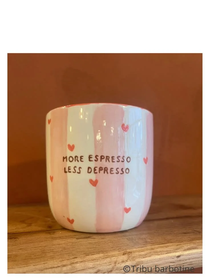
Stripes
Stripes, on the other hand, are where confidence comes in. Clean, graphic, and effortlessly chic, they give the illusion that you absolutely know what you’re doing (even if you’re quietly concentrating very hard). They’ve been around forever for a reason — they work. Whether you go monochrome and minimal or start experimenting with colour, stripes always land somewhere between “I just threw this together” and “this could be in a boutique.”
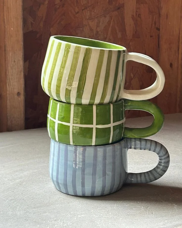
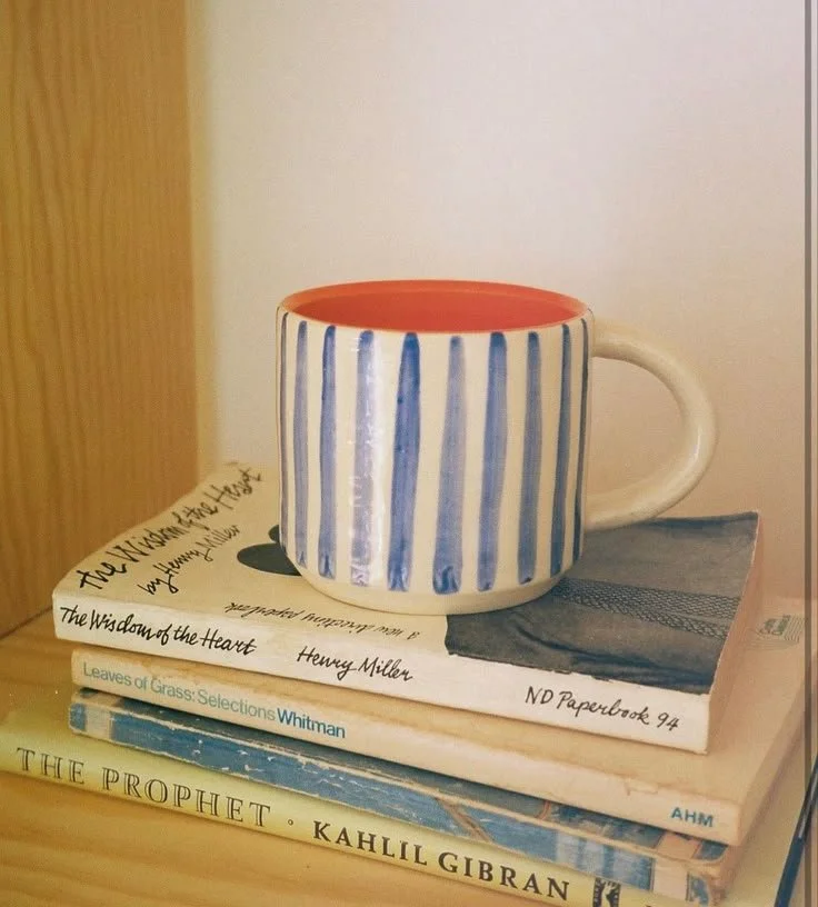
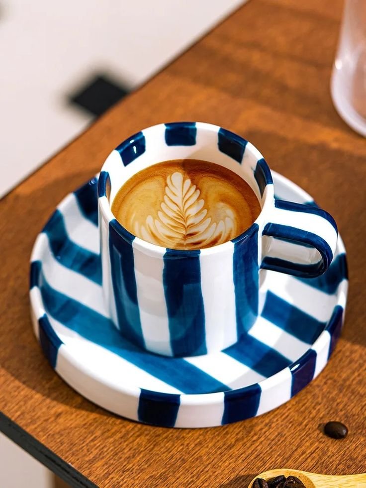
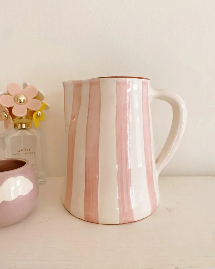
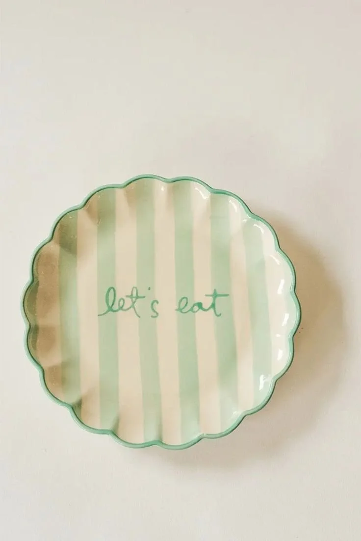
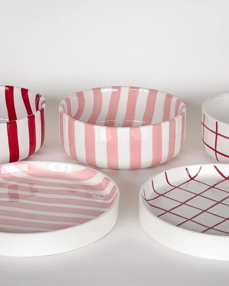
Together, spots and stripes are the safety net that still feels stylish. They’re timeless because they don’t rely on trends — they are the baseline. You can keep them simple or layer them up, mix colours, combine both if you’re feeling brave, and they’ll still look considered.
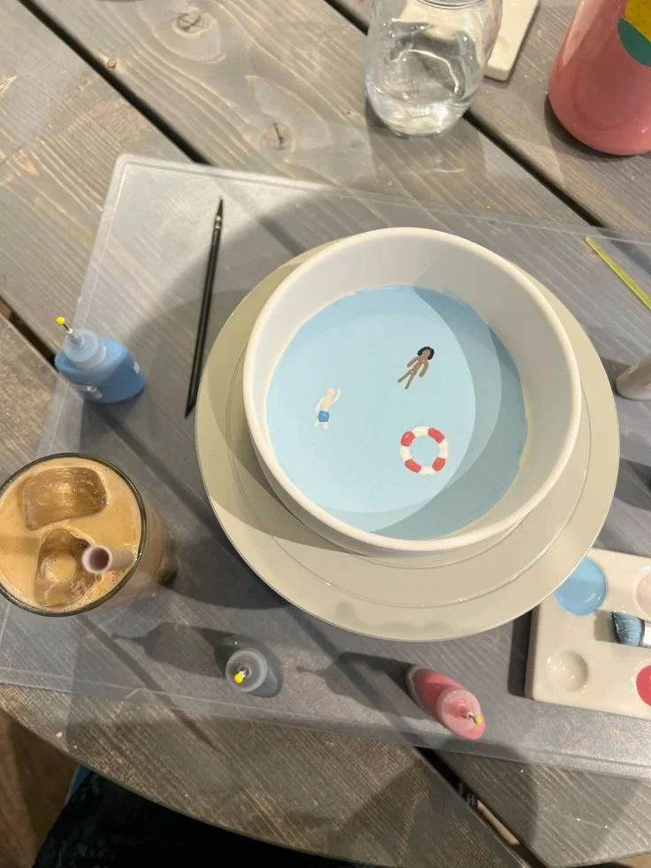
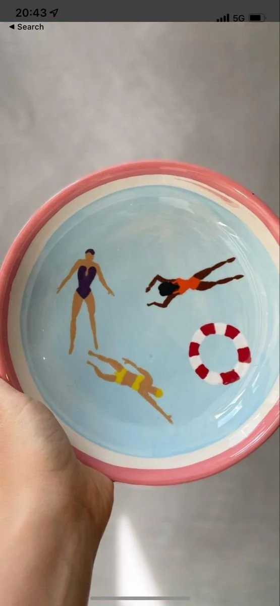
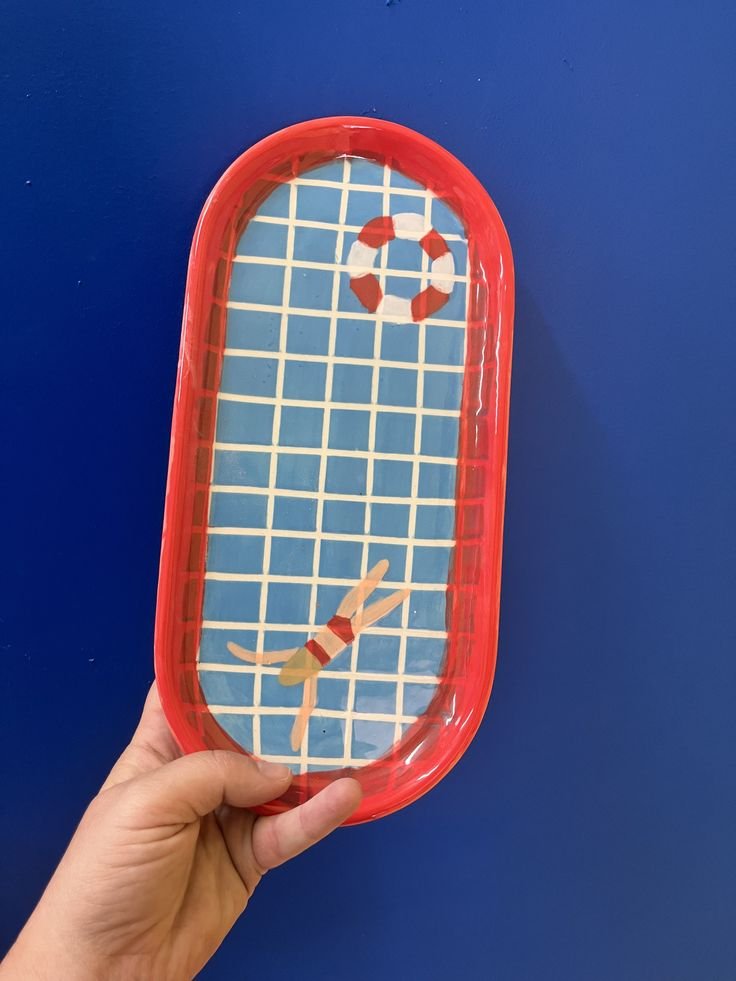
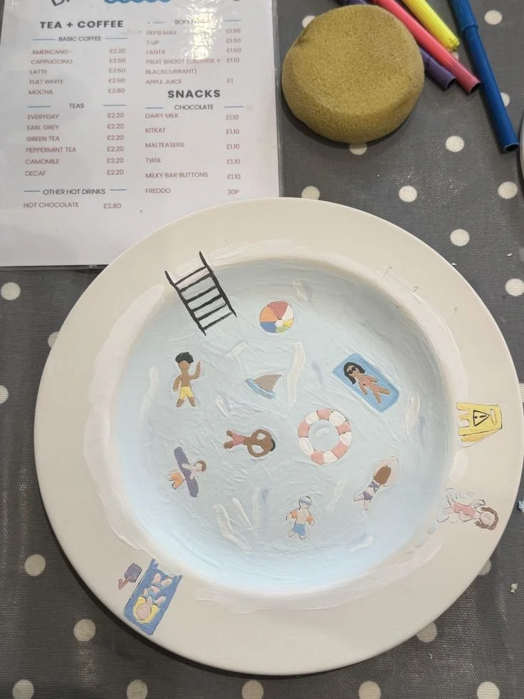
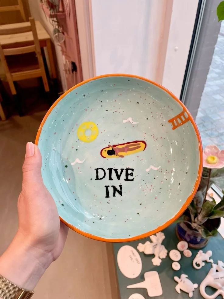
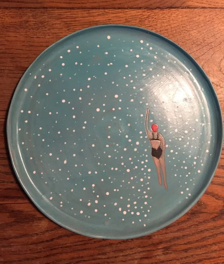
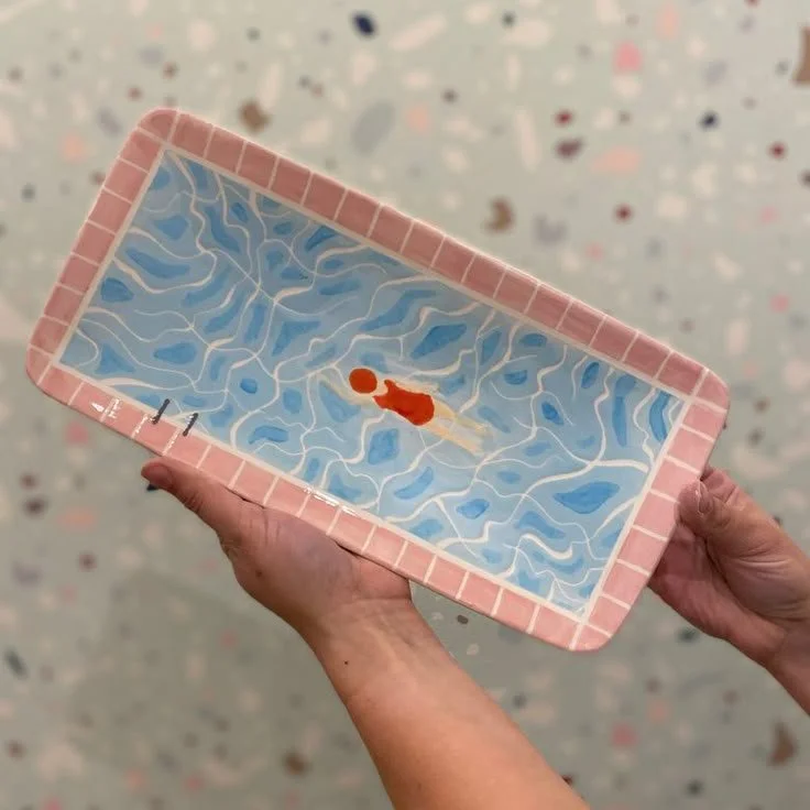
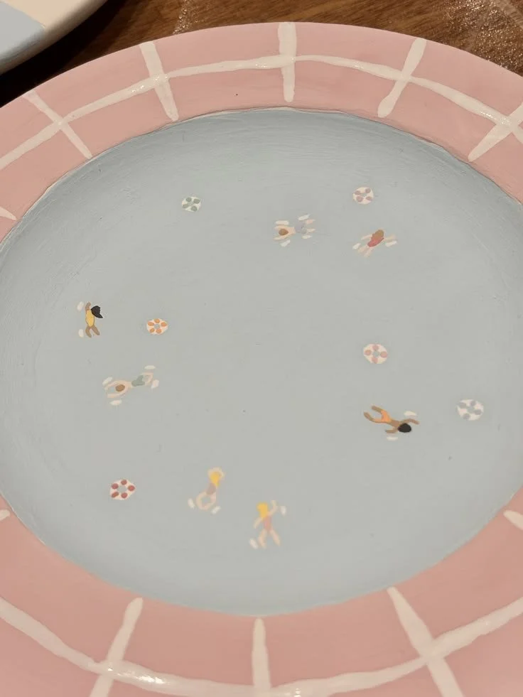
Dive In!
Summer’s Calling!
Waves, swimmers, dreamy blues — the kind of designs that make you feel like you’re on holiday even if you were just on the Northern line dripping sweat and avoiding the last seat!
This is pure escapism. Paint now, mentally relocate immediately.
Think Mamma Mia! energy. Sun, sea, no responsibilities. Just you and your slightly questionable brush technique.

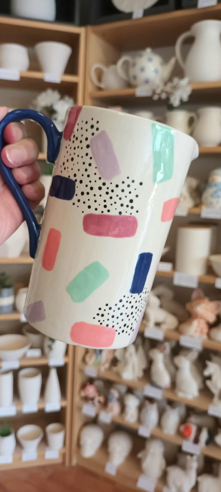
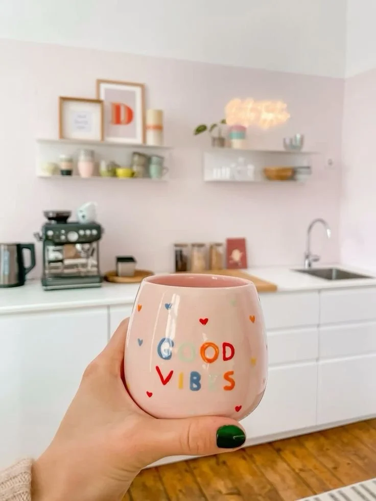
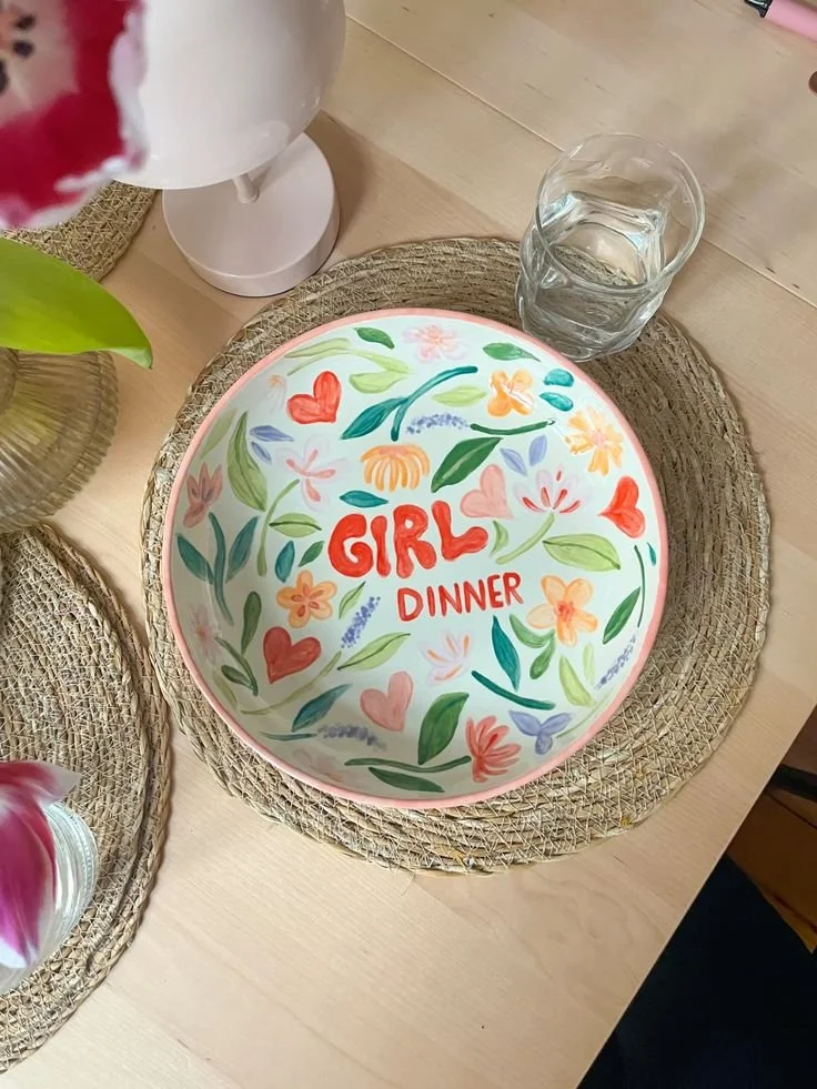
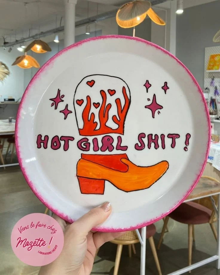
Maximum Happiness
Main Character Energy Only
This is where we go big. Bold colours, bold statements, no shrinking, no second-guessing. If the rest of the themes are about exploring, this one is about deciding — what do you actually want to see, read, and feel every day? And then putting that on a plate.
Think bright, unapologetic colour combinations. Words that feel a little bit powerful, a little bit indulgent, maybe even slightly delusional (in the best way). This is not the place for minimalism unless it’s intentional. This is about taking up space.
Because the truth is, we don’t actually get that many moments where we’re asked to create something purely for ourselves. No audience, no expectation, no need for it to be useful or productive. Just you, choosing something that makes you feel good.
“You do not exist to be pretty for anyone.” (Women Don’t Owe You Pretty)
But you can create something that reflects you — your energy, your mood, your standards. Whether that’s an affirmation you need to hear more often, a phrase that makes you laugh, or just colours that feel like a little hit of serotonin every time you see them.
Live boldly. Paint accordingly.
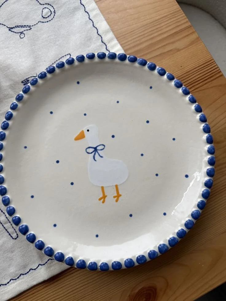
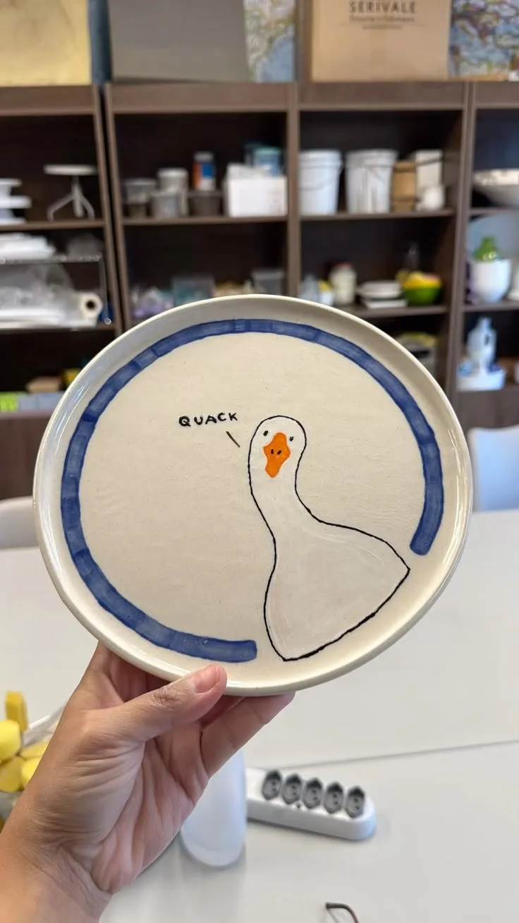
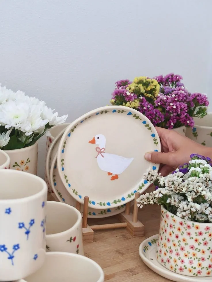
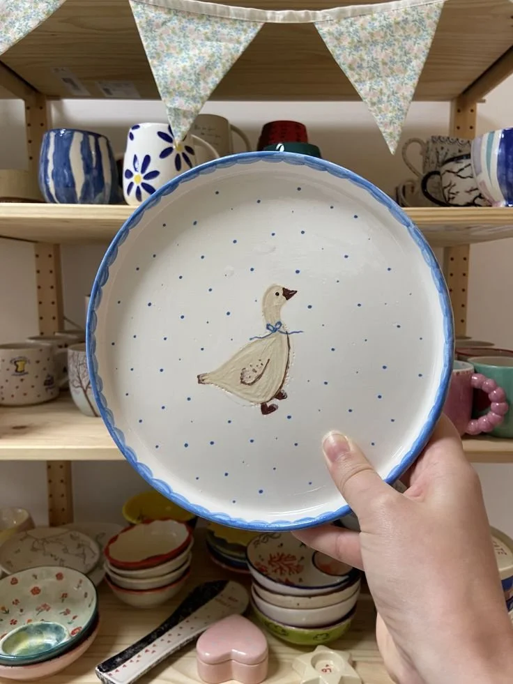
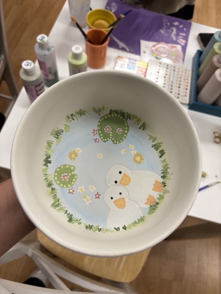
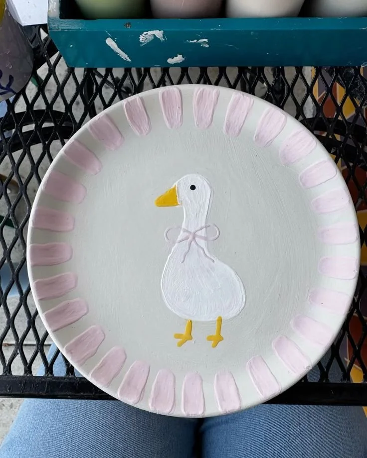
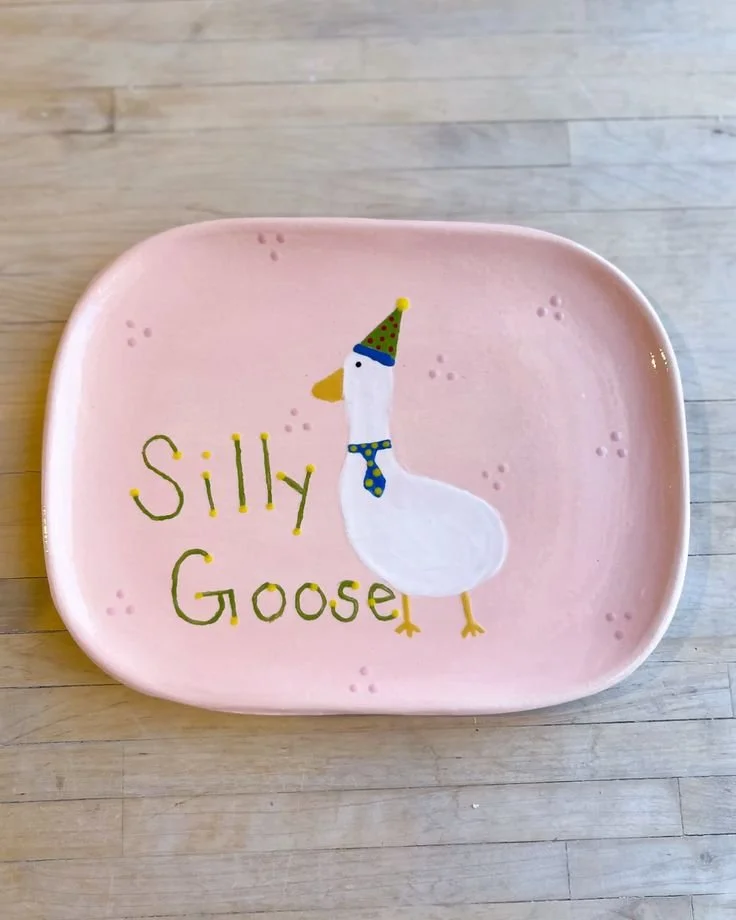
Silly goose on the Loose!
My favourite flock!
The phrase “silly goose” has long been a playful way of calling someone a little ridiculous in a light-hearted, unserious, and not overthinking it. Similar to being called bit of a ‘numpty’ or a ‘silly billy’ etc. Except, you’re my favourite flock of silly geese so why wouldn’t I suggest popping it on a plate?!
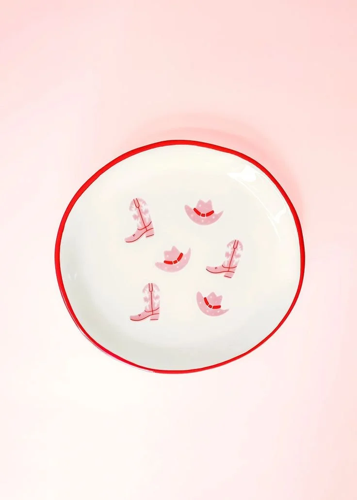
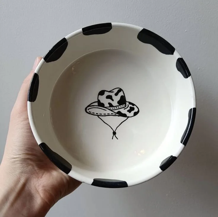
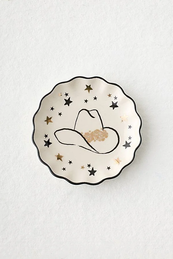
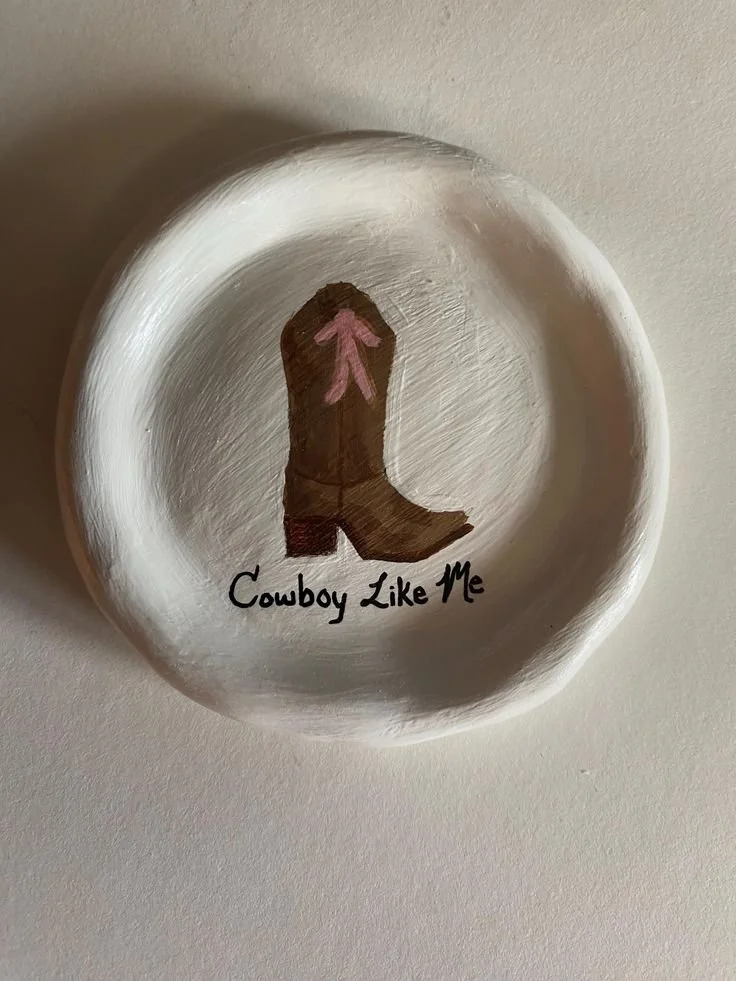
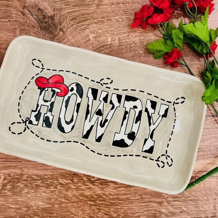
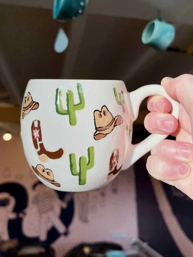
Let’s Go Girls!
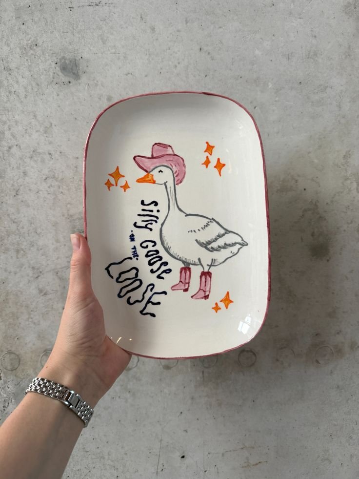
Save a Horse, Ride a Pottery Wheel
Not your first rodeo at the Pottery Saloon? Perfect. Even if it is, we can act like it’s not. Fake it ‘til you make it baby, unless you’re on a horse!
Hats, boots, stars, a little bit of yeehaw with the heavy confidence of kicking the door in on the patriarchy when Shania says: ‘Let’s go girls!’. Lean all the way in — bold shapes, strong lines, maybe even a phrase that feels like it belongs on a vintage sign somewhere off a dusty road.
And of course, this entire theme is best approached with Man! I Feel Like a Woman! playing loudly in your head. It’s fun, it’s nostalgic, it doesn’t take itself too seriously but it still lands every time. Slightly wonky star? Character. Questionable hat shape? Artistic licence.
This ain’t your first Brunch Book Club rodeo. And even if it is… no one needs to know.
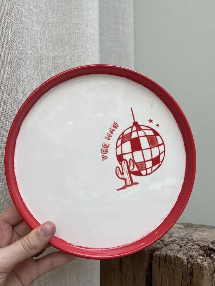
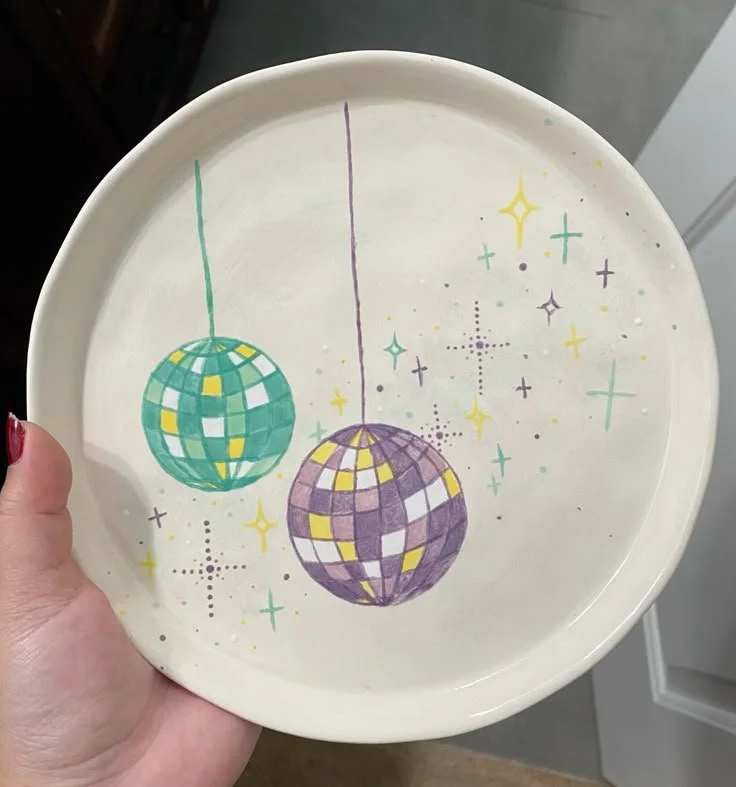
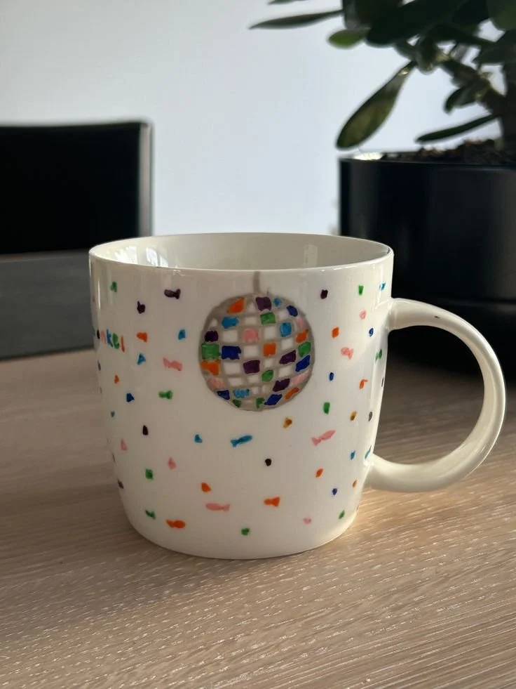
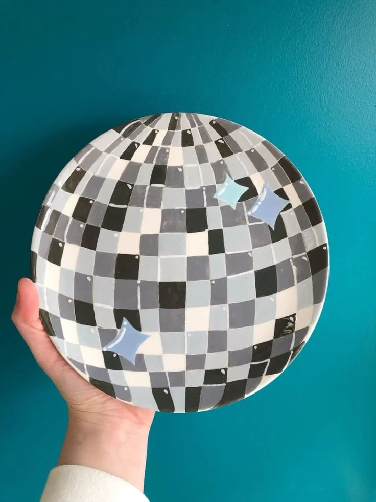
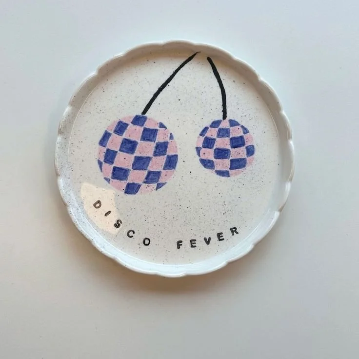
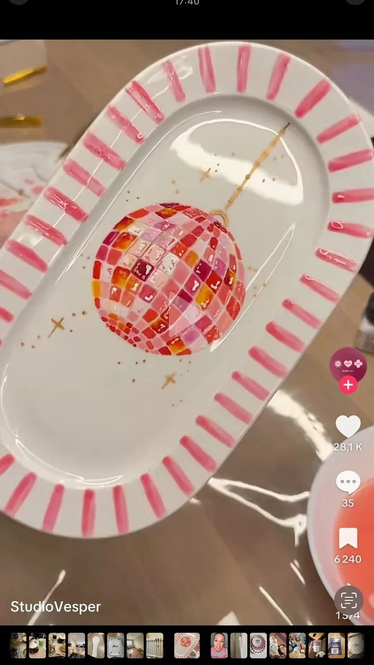
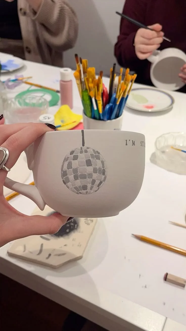
Disco! 🪩
Dancing Queen, feel the beat from the… paint brush?
More is more. Bold colours, playful shapes, a little bit of sparkle (visually, if not literally).
This is not the time for subtlety. This is your disco era. If it looks like it belongs on a 70s dancefloor, you’ve understood the assignment.
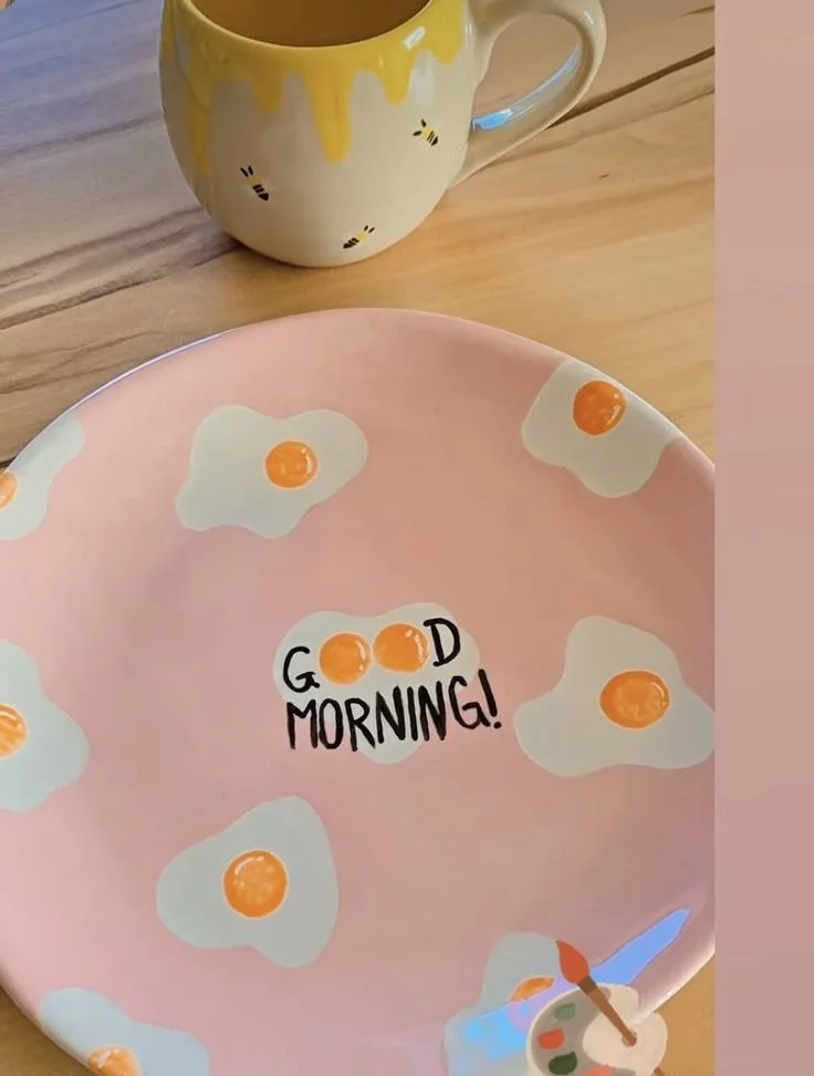
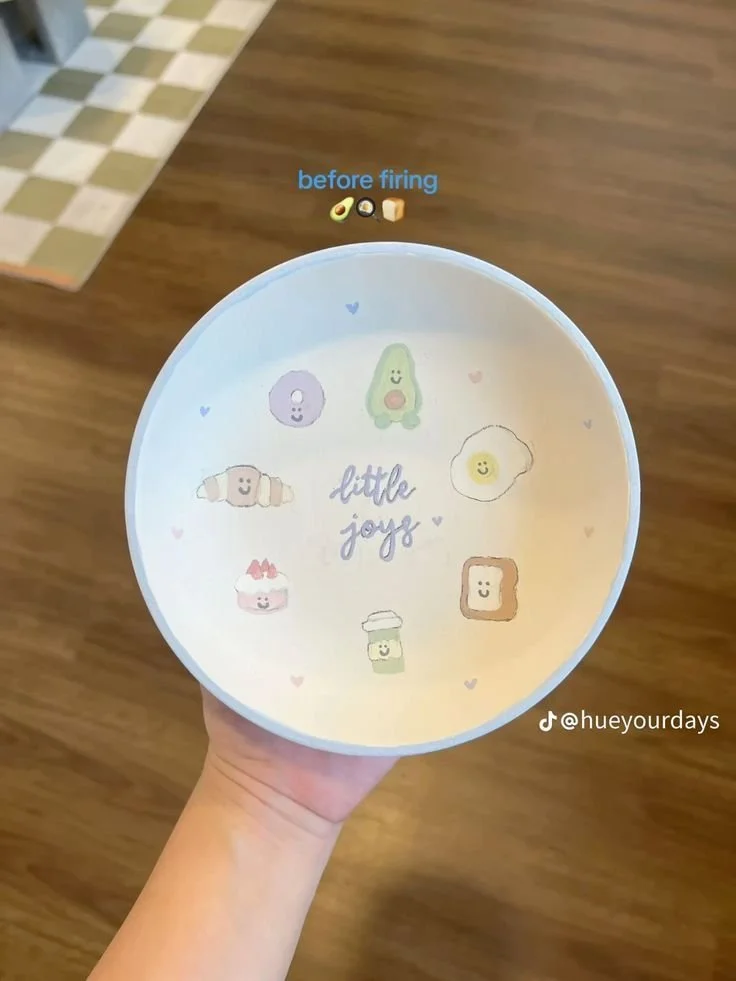
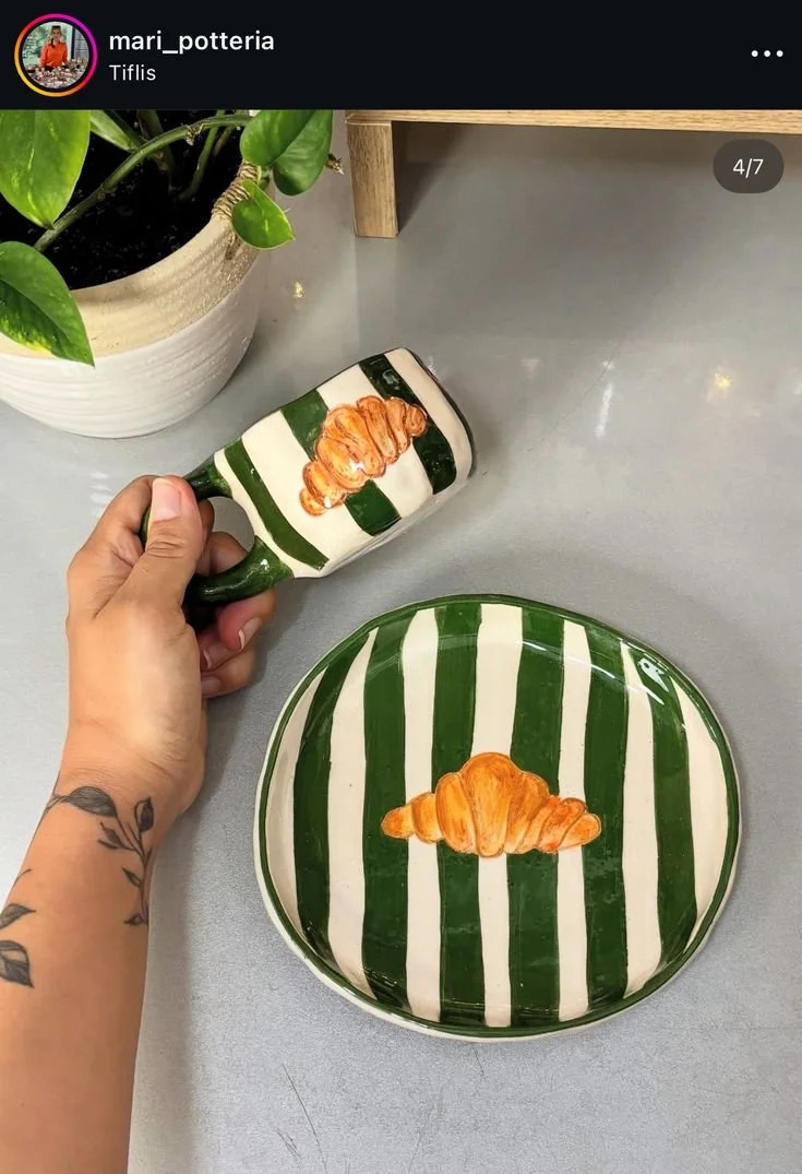
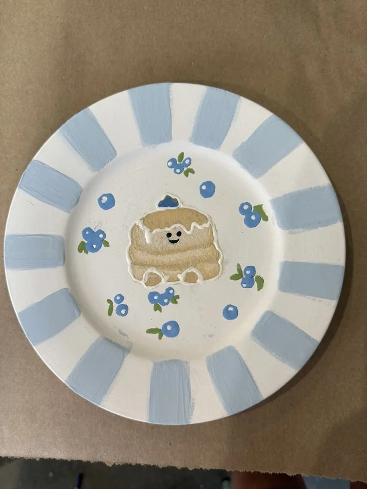
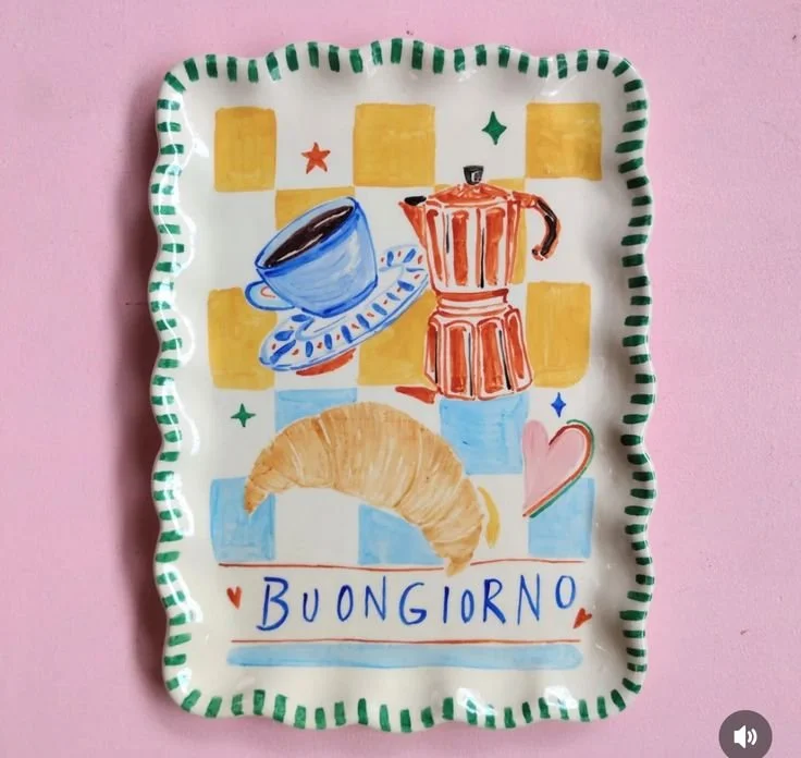
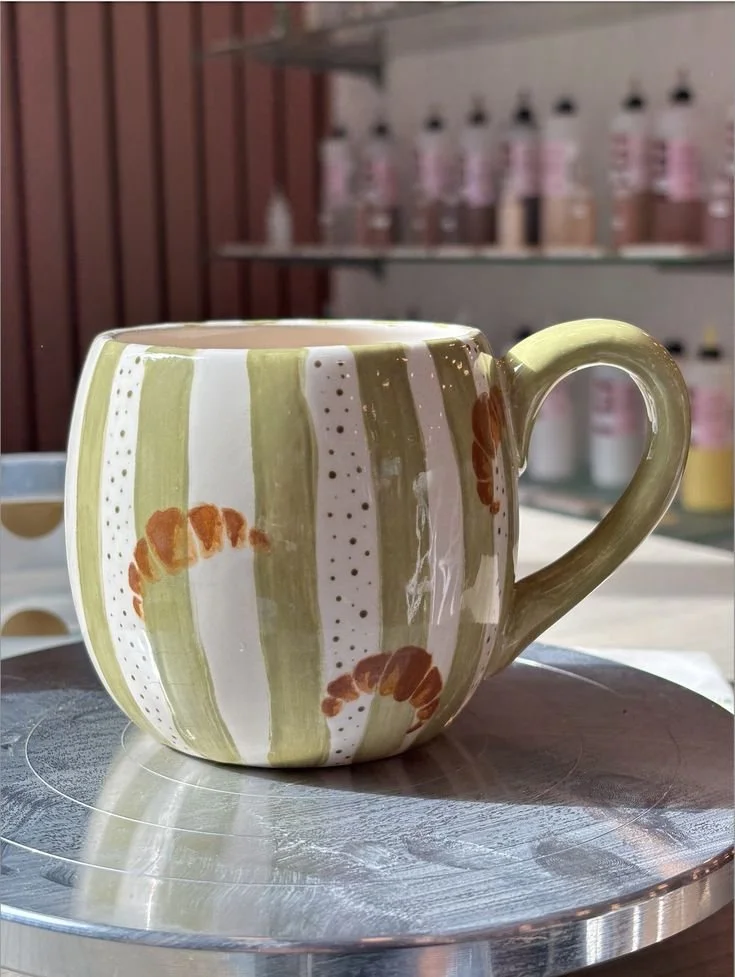
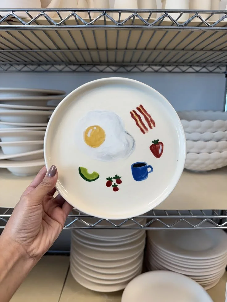
Brunch!
The most important meal of the day
It would be pretty audacious of me to call the book club Brunch Book Club and not include our favourite meal of the month!!
Croissants, coffee cups, maybe a mimosa if you’re feeling ambitious consider this as the place where your love of brunch meets your new creative hobby. Full circle, full plate.
I’ve included a range of ideas and options to inspire because brunch looks different to everyone. Paint what you love. Or what you wish you were eating or more appropriately, drinking!